
diff options
| author | justsaumit <justsaumit@draconyan.xyz> | 2022-03-02 11:23:45 +0530 |
|---|---|---|
| committer | justsaumit <justsaumit@draconyan.xyz> | 2022-03-02 11:23:45 +0530 |
| commit | a754011fc58e83f38cadc5bc10492ab961c9c540 (patch) | |
| tree | d7c3cd6fd254fb7e52759f77e44193bf103de177 /.local/usr | |
| parent | 98bbe7bd7fcec209e2408ff0b086858715ca89e0 (diff) | |
spring cleaning 0.1
Diffstat (limited to '.local/usr')
| -rw-r--r-- | .local/usr/wal-telegram/README.md | 55 | ||||
| -rw-r--r-- | .local/usr/wal-telegram/colors.default-constants | 445 | ||||
| -rw-r--r-- | .local/usr/wal-telegram/colors.wal-constants | 570 | ||||
| -rwxr-xr-x | .local/usr/wal-telegram/wal-telegram | 257 |
4 files changed, 1327 insertions, 0 deletions
diff --git a/.local/usr/wal-telegram/README.md b/.local/usr/wal-telegram/README.md new file mode 100644 index 0000000..bd540d9 --- /dev/null +++ b/.local/usr/wal-telegram/README.md @@ -0,0 +1,55 @@ +# Installation + +```bash +git clone --depth 1 https://github.com/matteoguarda/wal-telegram ~/.wal-telegram +cd ~/.wal-telegram +./wal-telegram +``` + +To set the theme follow these steps: + +1. Open telegram, go to "settings/chat background" and click on choose from file: + +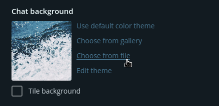 + +2. Toggle hidden files (in english that's show hidden files): + +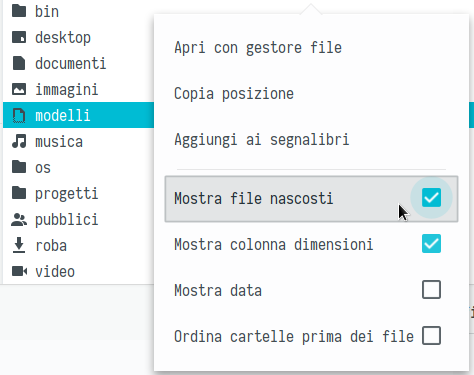 + +3. Double click on ~/.cache/wal-telegram/colors.tdesktop-theme: + +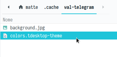 + +4. Click on keep changes: + +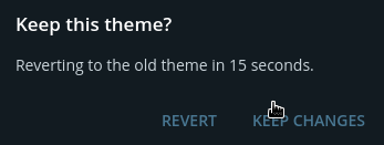 + +5. Double click on ~/.cache/wal-telegram/background.png or jpg depending on your wallpaper: + + + +# Updating + +You can update wal-telegram by running git pull inside ~/.wal-telegram: +```bash +cd ~/.wal-telegram +git pull +``` + +# Screenshots + +<img src="https://user-images.githubusercontent.com/40271651/42736395-79242280-8866-11e8-8419-a9dc0b22be4c.png" alt="demo" align="center"> +<img src="https://user-images.githubusercontent.com/40271651/42736398-7e628d04-8866-11e8-9b40-ee09c09910d7.png" alt="demo" align="center"> +<img src="https://user-images.githubusercontent.com/40271651/42736400-81f08110-8866-11e8-860d-d71c3e1b4c10.png" alt="demo" align="center"> + +# Important notes + +Some color constants in colors.tdesktop-theme are marked as // [UNTESTED], this because I couldn't find the elements responsable in the app. +So if you find something strange open an issue (with a screenshot of the element and it's name if possible) and I'll fix. + +You can also use light colorschemes, no need for extra option, just run tde normally. + +The theme works with [wal] too, not just [pywal]. + +[pywal]: https://github.com/dylanaraps/pywal +[wal]: https://github.com/dylanaraps/wal diff --git a/.local/usr/wal-telegram/colors.default-constants b/.local/usr/wal-telegram/colors.default-constants new file mode 100644 index 0000000..85e01f0 --- /dev/null +++ b/.local/usr/wal-telegram/colors.default-constants @@ -0,0 +1,445 @@ +windowBg: #282e33; // white: fallback for background +windowFg: #f5f5f5; // black: fallback for text +windowBgOver: #313b43; // light gray: fallback for background with mouse over +windowBgRipple: #3f4850; // darker gray: fallback for ripple effect +windowFgOver: #e9ecf0; // black: fallback for text with mouse over +windowSubTextFg: #82868a; // gray: fallback for additional text +windowSubTextFgOver: #797b7f; // darker gray: fallback for additional text with mouse over +windowBoldFg: #e9e8e8; // dark gray: fallback for bold text +windowBoldFgOver: #e9e9e9; // dark gray: fallback for bold text with mouse over +windowBgActive: #3fc1b0; // bright blue: fallback for blue filled active areas +windowFgActive: #ffffff; // white: fallback for text on active areas +windowActiveTextFg: #4be1c3; // online blue: fallback for active text like online status +windowShadowFg: #000000; // black: fallback for shadow +windowShadowFgFallback: windowBg; // gray: fallback for shadow without opacity +shadowFg: #00000018; // most shadows (including opacity) +slideFadeOutBg: #0000003c; // slide animation (chat to profile) fade out filling +slideFadeOutShadowFg: windowShadowFg; // slide animation (chat to profile) fade out right section shadow +imageBg: #000000; // image background fallback (when photo size is less than minimum allowed) +imageBgTransparent: #ffffff; // image background when displaying an image with opacity where no opacity is needed +activeButtonBg: #2da192; // default active button background +activeButtonBgOver: #32a898; // default active button background with mouse over +activeButtonBgRipple: #42b8a8; // default active button ripple effect +activeButtonFg: #ffffff; // default active button text +activeButtonFgOver: #ffffff; // default active button text with mouse over +activeButtonSecondaryFg: #8ee4d9; // default active button additional text (selected messages counter in forward / delete buttons) +activeButtonSecondaryFgOver: activeButtonSecondaryFg; // default active button additional text with mouse over +activeLineFg: #3ee2cc; // default active line (like code input field bottom border when you log in and field is focused) +activeLineFgError: #f57878; // default active line for error state (like code input field bottom border when you log in and you've entered incorrect code) +lightButtonBg: #282e33; // default light button background (like buttons in boxes) +lightButtonBgOver: #313b43; // default light button background with mouse over +lightButtonBgRipple: #3c474f; // default light button ripple effect +lightButtonFg: #79e8da; // default light button text +lightButtonFgOver: lightButtonFg; // default light button text with mouse over +attentionButtonFg: #f57474; // default attention button text (like confirm button on log out) +attentionButtonFgOver: #e76060; // default attention button text with mouse over +attentionButtonBgOver: #613a3a64; // default attention button background with mouse over +attentionButtonBgRipple: #f4c3c2; // default attention button ripple effect +outlineButtonBg: windowBg; // default left outlined button background (like shared media links in profiles) +outlineButtonBgOver: #313b43; // default left outlined button background with mouse over +outlineButtonOutlineFg: #29baa7; // default left outlined button left outline border +outlineButtonBgRipple: #3c474f; // default left outlined button ripple effect +menuBg: #282e33; // default popup menu background +menuBgOver: #ffffff; // default popup menu item background with mouse over +menuBgRipple: #26292d; // default popup menu item ripple effect +menuIconFg: #808080; // default popup menu item icon (like main menu) +menuIconFgOver: #dcdcdc; // default popup menu item icon with mouse over +menuSubmenuArrowFg: #757575; // default popup menu submenu arrow icon (like in message field context menu in case of RTL system language) +menuFgDisabled: #737373; // default popup menu item disabled text (like unavailable items in message field context menu) +menuSeparatorFg: #42484d; // default popup menu separator (like in message field context menu) +scrollBarBg: #ffffff53; // default scroll bar current rectangle, the bar itself (like in chats list) +scrollBarBgOver: #ffffff7a; // default scroll bar current rectangle with mouse over it +scrollBg: #ffffff1a; // default scroll bar background +scrollBgOver: #ffffff2c; // default scroll bar background with mouse over the scroll bar +smallCloseIconFg: #6d6d6d; // small X icon (like in Show all sessions box to the right for sessions termination) +smallCloseIconFgOver: #a3a3a3; // small X icon with mouse over +radialFg: windowFgActive; // default radial loader line (like in Media Viewer when loading a photo) +radialBg: #00000056; // default radial loader background (like in Media Viewer when loading a photo) +placeholderFg: #818991; // default input field placeholder when field is not focused (like in phone input field when you log in) +placeholderFgActive: #5d6165; // default input field placeholder when field is focused +inputBorderFg: #6f6f6f; // default input field bottom border (like in code input field when you log in and field is not focused) +filterInputBorderFg: #3d444b; // default rounded input field border (like in chats list search field when field is focused) +filterInputInactiveBg: #3d444b; // default rounded input field background (like in chats list search field when field is inactive) +checkboxFg: #6c6c6c; // default unchecked checkbox rounded rectangle (and also emoji category icons) +sliderBgInactive: #545454; // default slider not active bar (like in Settings when you choose interface scale or custom notifications count) +sliderBgActive: windowBgActive; // default slider active bar (like in Settings when you choose interface scale or custom notifications count) +tooltipBg: #d4dadd; // tooltip background (like when you put mouse over the message timestamp and wait) +tooltipFg: #9a9e9c; // tooltip text +tooltipBorderFg: #c9d1db; // tooltip border +titleShadow: #00000003; // one pixel line shadow at the bottom of custom window title +titleBg: #3a4047; // custom window title background when window is inactive +titleBgActive: titleBg; // custom window title background when window is active +titleButtonBg: titleBg; // custom window title minimize/maximize/restore button background when window is inactive (Windows only) +titleButtonFg: #8b9096; // custom window title minimize/maximize/restore button icon when window is inactive (Windows only) +titleButtonBgOver: #4c535b; // custom window title minimize/maximize/restore button background with mouse over when window is inactive (Windows only) +titleButtonFgOver: #e0e0e0; // custom window title minimize/maximize/restore button icon with mouse over when window is inactive (Windows only) +titleButtonBgActive: titleButtonBg; // custom window title minimize/maximize/restore button background when window is active (Windows only) +titleButtonFgActive: titleButtonFg; // custom window title minimize/maximize/restore button icon when window is active (Windows only) +titleButtonBgActiveOver: titleButtonBgOver; // custom window title minimize/maximize/restore button background with mouse over when window is active (Windows only) +titleButtonFgActiveOver: titleButtonFgOver; // custom window title minimize/maximize/restore button icon with mouse over when window is active (Windows only) +titleButtonCloseBg: titleButtonBg; // custom window title close button background when window is inactive (Windows only) +titleButtonCloseFg: titleButtonFg; // custom window title close button icon when window is inactive (Windows only) +titleButtonCloseBgOver: #e81123; // custom window title close button background with mouse over when window is inactive (Windows only) +titleButtonCloseFgOver: windowFgActive; // custom window title close button icon with mouse over when window is inactive (Windows only) +titleButtonCloseBgActive: titleButtonCloseBg; // custom window title close button background when window is active (Windows only) +titleButtonCloseFgActive: titleButtonCloseFg; // custom window title close button icon when window is active (Windows only) +titleButtonCloseBgActiveOver: titleButtonCloseBgOver; // custom window title close button background with mouse over when window is active (Windows only) +titleButtonCloseFgActiveOver: titleButtonCloseFgOver; // custom window title close button icon with mouse over when window is active (Windows only) +titleFg: #666666; // custom window title text when window is inactive (macOS only) +titleFgActive: #808080; // custom window title text when window is active (macOS only) +trayCounterBg: #f23c34; // tray icon counter background +trayCounterBgMute: #888888; // tray icon counter background if all unread messages are muted +trayCounterFg: #ffffff; // tray icon counter text +trayCounterBgMacInvert: #ffffff; // tray icon counter background when tray icon is pressed or when dark theme of macOS is used (macOS only) +trayCounterFgMacInvert: #ffffff01; // tray icon counter text when tray icon is pressed or when dark theme of macOS is used (macOS only) +layerBg: #0000007f; // box and main menu background layer fade +cancelIconFg: #666666; // default for settings close icon and box search cancel icon +cancelIconFgOver: #dcdcdc; // default for settings close icon and box search cancel icon with mouse over +boxBg: windowBg; // box background +boxTextFg: windowFg; // box text +boxTextFgGood: #56dbce; // accepted box text (like when choosing username that is not occupied) +boxTextFgError: #d84d4d; // rejecting box text (like when choosing username that is occupied) +boxTitleFg: #ebebeb; // box title text +boxSearchBg: #282e33; // box search field background (like in contacts box) +boxTitleAdditionalFg: #808080; // box title additional text (like in create group box when you see chosen members count) +boxTitleCloseFg: cancelIconFg; // settings close icon and box search cancel icon (like in contacts box) +boxTitleCloseFgOver: cancelIconFgOver; // settings close icon and box search cancel icon (like in contacts box) with mouse over +membersAboutLimitFg: #5e6065; // text in channel members box about the limit (max 200 last members are shown) +contactsBg: #222528; // contacts (and some other) box row background +contactsBgOver: #282e33; // contacts (and some other) box row background with mouse over +contactsNameFg: boxTextFg; // contacts (and some other) box row name text +contactsStatusFg: #808080; // contacts (and some other) box row additional text (like last seen stamp) +contactsStatusFgOver: #808080; // contacts (and some other) box row additional text (like last seen stamp) with mouse over +contactsStatusFgOnline: #55e1d3; // contacts (and some other) box row active additional text (like online status) +photoCropFadeBg: layerBg; // avatar crop box fade background (when choosing a new photo in Settings or for a group) +photoCropPointFg: #ffffff7f; // avatar crop box corner rectangles (when choosing a new photo in Settings or for a group) +callArrowFg: #2bc7b8; // received phone call arrow (in calls list box) +callArrowMissedFg: #dd5b4a; // missed phone call arrow (in calls list box) +introBg: windowBg; // login background +introTitleFg: #eeeeee; // login title text +introDescriptionFg: #999999; // login description text +introErrorFg: #999999; // login error text (like when providing a wrong log in code) +introCoverTopBg: #188173; // intro gradient top (from) +introCoverBottomBg: #188173; // intro gradient bottom (to) +introCoverIconsFg: #34a495; // intro cloud graphics +introCoverPlaneTrace: #329d8f; // intro plane traces +introCoverPlaneInner: #ced9e2; // intro plane part +introCoverPlaneOuter: #97a9b5; // intro plane part +introCoverPlaneTop: #ffffff; // intro plane part +dialogsMenuIconFg: menuIconFg; // main menu and lock telegram icon +dialogsMenuIconFgOver: menuIconFgOver; // main menu and lock telegram icon with mouse over +dialogsBg: windowBg; // chat list background +dialogsNameFg: #f5f5f5; // chat list name text +dialogsChatIconFg: dialogsNameFg; // chat list group or channel icon +dialogsDateFg: #6d727c; // chat list date text +dialogsTextFg: #8d939e; // chat list message text +dialogsTextFgService: #ebebeb; // chat list group sender name text (or media message type text) +dialogsDraftFg: #ec6657; // chat list draft label +dialogsVerifiedIconBg: #53edde; // chat list verified icon background +dialogsVerifiedIconFg: #282e33; // chat list verified icon check +dialogsSendingIconFg: #727272; // chat list sending message icon (clock) +dialogsSentIconFg: #20eeda; // chat list sent message tick / double tick icon +dialogsUnreadBg: #05a091; // chat list unread badge background for not muted chat +dialogsUnreadBgMuted: #495159; // chat list unread badge background for muted chat +dialogsUnreadFg: #ffffff; // chat list unread badge text +dialogsBgOver: #353c43; // chat list background with mouse over +dialogsNameFgOver: windowBoldFgOver; // chat list name text with mouse over +dialogsChatIconFgOver: dialogsNameFgOver; // chat list group or channel icon with mouse over +dialogsDateFgOver: #6d727c; // chat list date text with mouse over +dialogsTextFgOver: #a3a7ae; // chat list message text with mouse over +dialogsTextFgServiceOver: #f0f0f0; // chat list group sender name text with mouse over +dialogsDraftFgOver: dialogsDraftFg; // chat list draft label with mouse over +dialogsVerifiedIconBgOver: #53edde; // chat list verified icon background with mouse over +dialogsVerifiedIconFgOver: dialogsVerifiedIconFg; // chat list verified icon check with mouse over +dialogsSendingIconFgOver: dialogsSendingIconFg; // chat list sending message icon (clock) with mouse over +dialogsSentIconFgOver: #41f0df; // chat list sent message tick / double tick icon with mouse over +dialogsUnreadBgOver: #009687; // chat list unread badge background for not muted chat with mouse over +dialogsUnreadBgMutedOver: #555e67; // chat list unread badge background for muted chat with mouse over +dialogsUnreadFgOver: dialogsUnreadFg; // chat list unread badge text with mouse over +dialogsBgActive: #009687; // chat list background for current (active) chat +dialogsNameFgActive: windowFgActive; // chat list name text for current (active) chat +dialogsChatIconFgActive: dialogsNameFgActive; // chat list group or channel icon for current (active) chat +dialogsDateFgActive: windowFgActive; // chat list date text for current (active) chat +dialogsTextFgActive: windowFgActive; // chat list message text for current (active) chat +dialogsTextFgServiceActive: dialogsTextFgActive; // chat list group sender name text for current (active) chat +dialogsDraftFgActive: #c6f7f3; // chat list draft label for current (active) chat +dialogsVerifiedIconBgActive: dialogsTextFgActive; // chat list verified icon background for current (active) chat +dialogsVerifiedIconFgActive: dialogsBgActive; // chat list verified icon check for current (active) chat +dialogsSendingIconFgActive: #ffffff99; // chat list sending message icon (clock) for current (active) chat +dialogsSentIconFgActive: dialogsTextFgActive; // chat list sent message tick / double tick icon for current (active) chat +dialogsUnreadBgActive: dialogsTextFgActive; // chat list unread badge background for not muted chat for current (active) chat +dialogsUnreadBgMutedActive: #cbf7e9; // chat list unread badge background for muted chat for current (active) chat +dialogsUnreadFgActive: #039d8e; // chat list unread badge text for current (active) chat +dialogsRippleBg: #43474d; // +dialogsRippleBgActive: #12a798; // +dialogsForwardBg: dialogsBgActive; // forwarding panel background (when forwarding messages in the smallest window size) +dialogsForwardFg: dialogsNameFgActive; // forwarding panel text (when forwarding messages in the smallest window size) +searchedBarBg: #3a4047; // search results bar background (in chats list, contacts box..) +searchedBarFg: #a8a8a8; // search results bar text (in chats list, contacts box..) +topBarBg: #282e33; // top bar background (in chat view, media overview..) +emojiPanBg: windowBg; // emoji panel background +emojiPanCategories: #20262b; // emoji panel categories background +emojiPanHeaderFg: #90949a; // emoji panel section header text +emojiPanHeaderBg: #fffffff2; // emoji panel section header background +stickerPanDeleteBg: #000000cc; // delete X button background for custom sent stickers in stickers panel (legacy) +stickerPanDeleteFg: windowFgActive; // delete X button icon for custom sent stickers in stickers panel (legacy) +stickerPreviewBg: #000000b0; // sticker and GIF preview background (when you press and hold on a sticker) +historyTextInFg: windowFg; // inbox message text +historyTextInFgSelected: #ffffff; // inbox message selected text or text in a selected message +historyTextOutFg: #e4ecf2; // outbox message text +historyTextOutFgSelected: #ffffff; // outbox message selected text or text in a selected message +historyLinkInFg: #37e1cb; // inbox message link +historyLinkInFgSelected: #a7fff4; // inbox message link in a selected text or message +historyLinkOutFg: #37e1cb; // outbox message link +historyLinkOutFgSelected: #a7fff4; // outbox message link in a selected text or message +historyFileNameInFg: historyTextInFg; // inbox media filename text +historyFileNameInFgSelected: #ffffff; // inbox media filename text in a selected message +historyFileNameOutFg: historyTextOutFg; // outbox media filename text +historyFileNameOutFgSelected: #ffffff; // outbox media filename text in a selected message +historyOutIconFg: #40e6c5; // outbox message tick / double tick icon +historyOutIconFgSelected: #ffffff; // outbox message tick / double tick icon in a selected message +historyIconFgInverted: #40e6c5; // media message tick / double tick icon (like in sent photo) +historySendingOutIconFg: #9eface; // outbox sending message icon (clock) +historySendingInIconFg: #76838b; // inbox sending message icon (clock) (like in sent messages to yourself or in sent messages to a channel) +historySendingInvertedIconFg: #ffffffc8; // media sending message icon (clock) (like in sent photo) +historyCallArrowInFg: #26c2ad; // received phone call arrow +historyCallArrowInFgSelected: #ffffff; // received phone call arrow in a selected message +historyCallArrowMissedInFg: callArrowMissedFg; // missed phone call arrow +historyCallArrowMissedInFgSelected: #ffffff; // missed phone call arrow in a selected message +historyCallArrowOutFg: #ffffff; // outgoing phone call arrow +historyCallArrowOutFgSelected: #ffffff; // outgoing phone call arrow +historyUnreadBarBg: #33393f; // new unread messages bar background +historyUnreadBarBorder: shadowFg; // new unread messages bar shadow +historyUnreadBarFg: #3cd3bf; // new unread messages bar text +historyForwardChooseBg: #0000004c; // forwarding messages in a large window size "choose recipient" background +historyForwardChooseFg: windowFgActive; // forwarding messages in a large window size "choose recipient" text +historyPeer1NameFg: #ec7577; // red group member name +historyPeer1NameFgSelected: #ffffff; // red group member name in a selected message +historyPeer1UserpicBg: #e17076; // red userpic background +historyPeer2NameFg: #86d67f; // green group member name +historyPeer2NameFgSelected: #ffffff; // green group member name in a selected message +historyPeer2UserpicBg: #7bc862; // green userpic background +historyPeer3NameFg: #e4c054; // yellow group member name +historyPeer3NameFgSelected: #ffffff; // yellow group member name in a selected message +historyPeer3UserpicBg: #ccad4f; // yellow userpic background +historyPeer4NameFg: #68c7f3; // blue group member name +historyPeer4NameFgSelected: #ffffff; // blue group member name in a selected message +historyPeer4UserpicBg: #65aadd; // blue userpic background +historyPeer5NameFg: #b383f3; // purple group member name +historyPeer5NameFgSelected: #ffffff; // purple group member name in a selected message +historyPeer5UserpicBg: #a695e7; // purple userpic background +historyPeer6NameFg: #e16794; // pink group member name +historyPeer6NameFgSelected: #ffffff; // pink group member name in a selected message +historyPeer6UserpicBg: #ee7aae; // pink userpic background +historyPeer7NameFg: #57c9e0; // sea group member name +historyPeer7NameFgSelected: #ffffff; // sea group member name in a selected message +historyPeer7UserpicBg: #6ec9cb; // sea userpic background +historyPeer8NameFg: #efb05d; // orange group member name +historyPeer8NameFgSelected: #ffffff; // orange group member name in a selected message +historyPeer8UserpicBg: #eda86c; // orange userpic background +historyPeerUserpicFg: windowFgActive; // default userpic initials +historyScrollBarBg: #8989897a; // scroll bar current rectangle, the bar itself in the chat view (adjusted) +historyScrollBarBgOver: #6b6b6bbc; // scroll bar current rectangle with mouse over it in the chat view (adjusted) +historyScrollBg: #5f5f5f4c; // scroll bar background (adjusted) +historyScrollBgOver: #6262626b; // scroll bar background with mouse over the scroll bar (adjusted) +msgInBg: #33393f; // inbox message background +msgInBgSelected: #009687; // inbox selected message background (and background of selected text in those messages) +msgOutBg: #2a2f33; // outbox message background +msgOutBgSelected: #009687; // outbox selected message background (and background of selected text in those messages) +msgSelectOverlay: #35d4bf4c; // overlay which is filling the media parts of selected messages (like in selected photo message) +msgStickerOverlay: #35d4bf7f; // overlay which is filling the selected sticker message +msgInServiceFg: windowActiveTextFg; // inbox message information text (like information about a forwarded message original sender) +msgInServiceFgSelected: #ffffff; // inbox selected message information text (like information about a forwarded message original sender) +msgOutServiceFg: #60e5cb; // outbox message information text (like information about a forwarded message original sender) +msgOutServiceFgSelected: #ffffff; // outbox message information text (like information about a forwarded message original sender) +msgInShadow: #748ea200; // inbox message shadow (below the bubble) +msgInShadowSelected: #538ebb00; // inbox selected message shadow (below the bubble) +msgOutShadow: #00000000; // outbox message shadow (below the bubble) +msgOutShadowSelected: #37a78d00; // outbox selected message shadow (below the bubble) +msgInDateFg: #828d94; // inbox message time text +msgInDateFgSelected: #ffffff; // inbox selected message time text +msgOutDateFg: #737f87; // outbox message time text +msgOutDateFgSelected: #ffffff; // outbox selected message time text +msgServiceFg: windowFgActive; // service message text (like date dividers or service message about the group title being changed) +msgServiceBg: #363c43c8; // service message background (like in a service message about group title being changed) (adjusted) +msgServiceBgSelected: #009687; // service message selected text background (like in a service message about group title being changed) (adjusted) +msgInReplyBarColor: #32ceb9; // inbox message reply outline +msgInReplyBarSelColor: #ffffff; // inbox selected message reply outline +msgOutReplyBarColor: #32ceb9; // outbox message reply outline +msgOutReplyBarSelColor: #ffffff; // outbox selected message reply outline +msgImgReplyBarColor: msgServiceFg; // sticker message reply outline +msgInMonoFg: #5aaba0; // inbox message monospace text (like a message sent with `test` text) +msgOutMonoFg: #c2f2ec; // outbox message monospace text +msgInMonoFgSelected: #a7fff4; // inbox message monospace text in a selected text or message +msgOutMonoFgSelected: #c9fff8; // outbox message monospace text in a selected text or message +msgDateImgFg: msgServiceFg; // media message time text (like time text in a sent photo) +msgDateImgBg: #00000054; // media message time bubble background (like time bubble in a sent photo) or file with thumbnail download icon circle background +msgDateImgBgOver: #00000074; // media message download icon circle background with mouse over (like file with thumbnail download icon) +msgDateImgBgSelected: #1c706587; // selected media message time bubble background +msgFileThumbLinkInFg: lightButtonFg; // inbox media file message with thumbnail download / open with button text +msgFileThumbLinkInFgSelected: lightButtonFgOver; // inbox selected media file message with thumbnail download / open with button text +msgFileThumbLinkOutFg: #60e5cb; // outbox media file message with thumbnail download / open with button text +msgFileThumbLinkOutFgSelected: #ffffff; // outbox selected media file message with thumbnail download / open with button text +msgFileInBg: #50d4c3; // inbox audio file download circle background +msgFileInBgOver: #48cfbd; // inbox audio file download circle background with mouse over +msgFileInBgSelected: #ffffff; // inbox selected audio file download circle background +msgFileOutBg: #11bfab; // outbox audio file download circle background +msgFileOutBgOver: #ffffff; // outbox audio file download circle background with mouse over +msgFileOutBgSelected: #ffffff; // outbox selected audio file download circle background +msgFile1Bg: #3fbbab; // blue shared links / files without image square thumbnail +msgFile1BgDark: #269f8f; // blue shared files without image download circle background +msgFile1BgOver: #52c4b5; // blue shared files without image download circle background with mouse over +msgFile1BgSelected: #ffffff; // blue shared files without image download circle background if file is selected +msgFile2Bg: #8ef5e8; // green shared links / shared files without image square thumbnail +msgFile2BgDark: #7ef7e7; // green shared files without image download circle background +msgFile2BgOver: #8df7e9; // green shared files without image download circle background with mouse over +msgFile2BgSelected: #ffffff; // green shared files without image download circle background if file is selected +msgFile3Bg: #e47272; // red shared links / shared files without image square thumbnail +msgFile3BgDark: #cd5b5e; // red shared files without image download circle background +msgFile3BgOver: #c35154; // red shared files without image download circle background with mouse over +msgFile3BgSelected: #9f6a82; // red shared files without image download circle background if file is selected +msgFile4Bg: #efc274; // yellow shared links / shared files without image square thumbnail +msgFile4BgDark: #e6a561; // yellow shared files without image download circle background +msgFile4BgOver: #dc9c5a; // yellow shared files without image download circle background with mouse over +msgFile4BgSelected: #b19d84; // yellow shared files without image download circle background if file is selected +historyFileInIconFg: #33393f; // inbox file without thumbnail (like audio file) download arrow icon +historyFileInIconFgSelected: #009687; // inbox selected file without thumbnail (like audio file) download arrow icon +historyFileInRadialFg: #33393f; // inbox file without thumbnail (like audio file) radial download animation line +historyFileInRadialFgSelected: historyFileInIconFgSelected; // inbox selected file without thumbnail (like audio file) radial download animation line +historyFileOutIconFg: #33393f; // outbox file without thumbnail (like audio file) download arrow icon +historyFileOutIconFgSelected: #009687; // outbox selected file without thumbnail (like audio file) download arrow icon +historyFileOutRadialFg: historyFileOutIconFg; // outbox file without thumbnail (like audio file) radial download animation line +historyFileOutRadialFgSelected: #009687; // outbox selected file without thumbnail (like audio file) radial download animation line +historyFileThumbIconFg: #efefef; // file with thumbnail (or photo / video) download arrow icon +historyFileThumbIconFgSelected: #ffffff; // selected file with thumbnail (or photo / video) download arrow icon +historyFileThumbRadialFg: historyFileThumbIconFg; // file with thumbnail (or photo / video) radial download animation line +historyFileThumbRadialFgSelected: #ffffff; // selected file with thumbnail (or photo / video) radial download animation line +historyVideoMessageProgressFg: historyFileThumbIconFg; // radial playback progress in round video messages +msgWaveformInActive: windowBgActive; // inbox voice message active waveform lines (like played part of currently playing voice message) +msgWaveformInActiveSelected: #ffffff; // inbox selected voice message active waveform lines (like played part of currently playing voice message) +msgWaveformInInactive: #5d6b76; // inbox voice message inactive waveform lines (like upcoming part of currently playing voice message) +msgWaveformInInactiveSelected: #41d1c0; // inbox selected voice message inactive waveform lines (like upcoming part of currently playing voice message) +msgWaveformOutActive: #11bfab; // outbox voice message active waveform lines (like played part of currently playing voice message) +msgWaveformOutActiveSelected: #ffffff; // outbox selected voice message active waveform lines (like played part of currently playing voice message) +msgWaveformOutInactive: #596874; // outbox voice message inactive waveform lines (like upcoming part of currently playing voice message) +msgWaveformOutInactiveSelected: #41d1c0; // outbox selected voice message inactive waveform lines (like upcoming part of currently playing voice message) +msgBotKbOverBgAdd: #ffffff14; // this is painted over a bot inline keyboard button (which has msgServiceBg background) when mouse is over that button +msgBotKbIconFg: msgServiceFg; // bot inline keyboard button icon in the top-right corner (like in @vote bot when a poll is ready to be shared) +msgBotKbRippleBg: #9e9d9d10; // bot inline keyboard button ripple effect +mediaInFg: msgInDateFg; // inbox media message status text (like in file that is being downloaded) +mediaInFgSelected: msgInDateFgSelected; // inbox selected media message status text (like in file that is being downloaded) +mediaOutFg: msgOutDateFg; // outbox media message status text (like in file that is being downloaded) +mediaOutFgSelected: msgOutDateFgSelected; // outbox selected media message status text (like in file that is being downloaded) +youtubePlayIconBg: #e83131c8; // youtube play icon background (when a link to a youtube video with a webpage preview is sent) +youtubePlayIconFg: windowFgActive; // youtube play icon arrow (when a link to a youtube video with a webpage preview is sent) +videoPlayIconBg: #0000007f; // other video play icon background (like when a link to a vimeo video with a webpage preview is sent) +videoPlayIconFg: #ffffff; // other video play icon arrow (like when a link to a vimeo video with a webpage preview is sent) +toastBg: #000000b2; // toast notification background (like when you click on your t.me link when editing your username) +toastFg: windowFgActive; // toast notification text (like when you click on your t.me link when editing your username) +reportSpamBg: #363c42; // report spam panel background (like a non contact user writes your for the first time) +reportSpamFg: windowFg; // report spam panel text (when you send a report from that panel) +historyToDownBg: #434d57; // arrow button background (to scroll to the end of the viewed chat) +historyToDownBgOver: #515b65; // arrow button background with mouse over +historyToDownBgRipple: #636d77; // arrow button ripple effect +historyToDownFg: #adb4ba; // arrow button icon +historyToDownFgOver: menuIconFgOver; // arrow button icon with mouse over +historyToDownShadow: #00000040; // arrow button shadow +historyComposeAreaBg: #282e33; // history compose area background (message write area / reply information / forwarding information) +historyComposeAreaFg: historyTextInFg; // history compose area text +historyComposeAreaFgService: msgInDateFg; // history compose area text when replying to a media message +historyComposeIconFg: menuIconFg; // history compose area icon (like emoji, attach, bot command..) +historyComposeIconFgOver: menuIconFgOver; // history compose area icon with mouse over +historySendIconFg: windowBgActive; // send message icon +historySendIconFgOver: windowBgActive; // send message icon with mouse over +historyPinnedBg: historyComposeAreaBg; // pinned message area background +historyReplyBg: historyComposeAreaBg; // reply / forward / edit message area background +historyReplyIconFg: windowBgActive; // reply / forward / edit message left icon +historyReplyCancelFg: cancelIconFg; // reply / forward / edit message cancel button +historyReplyCancelFgOver: cancelIconFgOver; // reply / forward / edit message cancel button with mouse over +historyComposeButtonBg: historyComposeAreaBg; // unblock / join channel / mute channel button background +historyComposeButtonBgOver: #31363c; // unblock / join channel / mute channel button background with mouse over +historyComposeButtonBgRipple: #272b2f; // unblock / join channel / mute channel button ripple effect +overviewCheckBg: #00000040; // shared files / links checkbox background for not selected rows when some rows are selected +overviewCheckFg: #ffffff; // shared files / links checkbox icon for not selected rows when some rows are selected +overviewCheckFgActive: #ffffff; // shared files / links checkbox icon for selected rows +overviewPhotoSelectOverlay: #40ace333; // shared photos / videos / links fill for selected rows +profileStatusFgOver: #9c9c9c; // group members list in group profile user last seen text with mouse over +profileVerifiedCheckBg: windowBgActive; // profile verified check icon background +profileVerifiedCheckFg: windowFgActive; // profile verified check icon tick +profileAdminStartFg: windowBgActive; // group members list admin star icon +notificationsBoxMonitorFg: windowFg; // custom notifications settings box monitor color +notificationsBoxScreenBg: dialogsBgActive; // #6389a8; // custom notifications settings box monitor screen background +notificationSampleUserpicFg: windowBgActive; // custom notifications settings box small sample userpic placeholder +notificationSampleCloseFg: #d7d7d7; // custom notifications settings box small sample close button placeholder +notificationSampleTextFg: #d7d7d7; // custom notifications settings box small sample text placeholder +notificationSampleNameFg: #939393; // custom notifications settings box small sample name placeholder +changePhoneSimcardFrom: notificationSampleTextFg; // change phone number box left simcard icon +changePhoneSimcardTo: notificationSampleNameFg; // change phone number box right simcard and plane icons +mainMenuBg: windowBg; // main menu background +mainMenuCoverBg: #009687; // main menu top cover background +mainMenuCoverFg: windowFgActive; // main menu top cover text +mainMenuCloudFg: activeButtonFg; // +mainMenuCloudBg: #0e837f; // +mediaPlayerBg: windowBg; // audio file player background +mediaPlayerActiveFg: windowBgActive; // audio file player playback progress already played part +mediaPlayerInactiveFg: sliderBgInactive; // audio file player playback progress upcoming (not played yet) part with mouse over +mediaPlayerDisabledFg: #9dd1ef; // audio file player loading progress (when you're playing an audio file and switch to the previous one which is not loaded yet) +mediaviewFileBg: windowBg; // file rectangle background (when you view a png file in Media Viewer and go to a previous, not loaded yet, file) +mediaviewFileNameFg: windowFg; // file name in file rectangle +mediaviewFileSizeFg: windowSubTextFg; // file size text in file rectangle +mediaviewFileRedCornerFg: #d55959; // red file thumbnail placeholder corner in file rectangle (for a file without thumbnail, like .pdf) +mediaviewFileYellowCornerFg: #e8a659; // yellow file thumbnail placeholder corner in file rectangle (for a file without thumbnail, like .zip) +mediaviewFileGreenCornerFg: #49a957; // green file thumbnail placeholder corner in file rectangle (for a file without thumbnail, like .exe) +mediaviewFileBlueCornerFg: #599dcf; // blue file thumbnail placeholder corner in file rectangle (for a file without thumbnail, like .dmg) +mediaviewFileExtFg: activeButtonFg; // file extension text in file thumbnail placeholder in file rectangle +mediaviewMenuBg: #383838; // context menu in Media Viewer background +mediaviewMenuBgOver: #505050; // context menu item background with mouse over +mediaviewMenuBgRipple: #676767; // context menu item ripple effect +mediaviewMenuFg: windowFgActive; // context menu item text +mediaviewBg: #222222eb; // Media Viewer background +mediaviewVideoBg: imageBg; // Media Viewer background when viewing a video in full screen +mediaviewControlBg: #0000003c; // controls background (like next photo / previous photo) +mediaviewControlFg: windowFgActive; // controls icon (like next photo / previous photo) +mediaviewCaptionBg: #11111180; // caption text background (when viewing photo with caption) +mediaviewCaptionFg: mediaviewControlFg; // caption text +mediaviewTextLinkFg: #66f7e4; // caption text link +mediaviewSaveMsgBg: toastBg; // save to file toast message background in Media Viewer +mediaviewSaveMsgFg: toastFg; // save to file toast message text +mediaviewPlaybackActive: #c7c7c7; // video playback progress already played part +mediaviewPlaybackInactive: #252525; // video playback progress upcoming (not played yet) part +mediaviewPlaybackActiveOver: #ffffff; // video playback progress already played part with mouse over +mediaviewPlaybackInactiveOver: #474747; // video playback progress upcoming (not played yet) part with mouse over +mediaviewPlaybackProgressFg: #ffffffc7; // video playback progress text +mediaviewPlaybackIconFg: mediaviewPlaybackActive; // video playback controls icon +mediaviewPlaybackIconFgOver: mediaviewPlaybackActiveOver; // video playback controls icon with mouse over +mediaviewTransparentBg: #ffffff; // transparent filling part (when viewing a transparent .png file in Media Viewer) +mediaviewTransparentFg: #cccccc; // another transparent filling part +notificationBg: windowBg; // custom notification window background +callBg: #26282cf2; // phone call popup background +callNameFg: #ffffff; // phone call popup name text +callFingerprintBg: #00000066; // phone call popup emoji fingerprint background +callStatusFg: #aaabac; // phone call popup status text +callIconFg: #ffffff; // phone call popup answer, hangup and mute mic icon +callAnswerBg: #5ad1c1; // phone call popup answer button background +callAnswerRipple: #42c2b1; // phone call popup answer button ripple effect +callAnswerBgOuter: #3febc926; // phone call popup answer button outer ripple effect +callHangupBg: #d75a5a; // phone call popup hangup button background +callHangupRipple: #c04646; // phone call popup hangup button ripple effect +callCancelBg: #ffffff; // phone call popup line busy cancel button background +callCancelFg: #777777; // phone call popup line busy cancel button icon +callCancelRipple: #f1f1f1; // phone call popup line busy cancel button ripple effect +callMuteRipple: #ffffff12; // phone call popup mute mic ripple effect +callBarBg: dialogsBgActive; // active phone call bar background +callBarMuteRipple: dialogsRippleBgActive; // active phone call bar mute and hangup button ripple effect +callBarBgMuted: #8f8f8f; // phone call bar with muted mic background +callBarUnmuteRipple: #7f7f7f; // phone call bar with muted mic mute and hangup button ripple effect +callBarFg: dialogsNameFgActive; // phone call bar text and icons +importantTooltipBg: toastBg; // +importantTooltipFg: toastFg; // +importantTooltipFgLink: #65fce8; // +filterInputActiveBg: #3d444b; +botKbBg: #3d444b; +botKbDownBg: #494f55; +emojiIconFg: #6c7278; +emojiIconFgActive: #36cdb9; +overviewCheckBorder: #e4eaef; diff --git a/.local/usr/wal-telegram/colors.wal-constants b/.local/usr/wal-telegram/colors.wal-constants new file mode 100644 index 0000000..9a6bdf8 --- /dev/null +++ b/.local/usr/wal-telegram/colors.wal-constants @@ -0,0 +1,570 @@ +// vim:ft=cfg + +/* TODO: 1. Translate comments from italian to english (doing copy paste from + * telegram official documentation is not a good idea because IMHO + * it doesn't explain anything, useless). + * 2. Remove unused alpha colors. + * 3. Add the missing alpha colors. + * 4. Fix colors marked with [UNTESTED]. + */ + +// Colors for testing purposes +colorPink: #ff7fc6; +colorGreen: #0bd500; + +// Basic window options +windowBg: color0; // sfondo della parte sinitra più menu opzioni e menu sinistra +windowFg: color7; // colore fg testo normale + opzioni menu tasto destra +windowBgOver: colorLighter0_40; // colore bg opzioni menu sinistra e menu tasto destro con cursore sopra +windowBgRipple: color1; // colore bg opzioni menu sinistra e menu tasto destro con click premuto +windowFgOver: color7; // colore fg opzioni menu tasto destra con cursore sopra +windowSubTextFg: colorDarker7_40; // testo in basso a sinistra nel menu sinistra + testo messo in meno risalto nel menu opzioni +windowSubTextFgOver: color7; // [UNTESTED]: in teoria come all'opzione sopra ma con cursore sopra +windowBoldFg: colorLighter7_20; // colore testo in grassetto, che si trova nelle opzioni del menu sinstra, titoli menu opzioni e titoli descrizioni gruppo +windowBoldFgOver: colorLighter7_40; // uguale a sopra ma con il cursore sopra, ad esempio nelle opzioni del menu sinistra +windowBgActive: color2; // sfondo dei tick e altre cose che "si riempiono di colore", vedi menu opzioni +windowFgActive: colorLighter7_40; // fg della parte top del menu sinistra e delle cose che hanno come sfondo l'opzione sopra, segno dei tick, titolo chat attiva ecc... +windowActiveTextFg: color2; // testo online e testo sottolineato nel menu opzioni +windowShadowFg: color0; // ombra di contorno menu sinistra, menu opzioni e insomma un po tutti gli elementi dotati di ombra +windowShadowFgFallback: windowBg; // [UNTESTED]: fallback per ombre senza opacità + +// Shadow +shadowFg: colorAlpha0_18; // la maggior parte delle ombre (con opacità) (il colore del divisore tra le parti della schermata principale) + +// Slide +slideFadeOutBg: colorAlpha0_3c; // animazione che c'è quando premi sulla freccia di un mex inoltrato (dalla chat al profilo) +slideFadeOutShadowFg: windowShadowFg; // sempre parlando della animazione spiegata sopra, è la riga del lato destro che si sposta verso sinistra + +// Image +imageBg: color2; // [UNTESTED]: quando la foto è meno grande delle dimensioni max +imageBgTransparent: color7; // sfondo immagine quando si tratta di una immagine con opacità, anche se questa non è richiesta + +// Active +activeButtonBg: color2; // colore bg bottone attivo, tipo il primo bottone in alto a sinistra nel menu opzioni +activeButtonBgOver: colorLighter2_30; // come sopra ma con il cursore sopra +activeButtonBgRipple: colorLighter2_50; // come sopra ma effetto ripple, click tenuto +activeButtonFg: color7; // testo del bottone spiegato sopra +activeButtonFgOver: colorLighter7_30; // testo del bottone spiegato sopra ma con cursore sopra +activeButtonSecondaryFg: colorLighter7_50; // quando si seleziona un messaggio, i numerini vicino a inoltra ed elimina +activeButtonSecondaryFgOver: activeButtonSecondaryFg; // uguale a sopra ma con il cursore sopra +activeLineFg: color2; // tipo la linea sotto la scelta del nome quando si crea un gruppo +activeLineFgError: color1; // uguale a sopra ma quando si verificano errori + +// Light +lightButtonBg: color0; // bottone a destra nel menu opzioni e insomma i bottoni chiari +lightButtonBgOver: colorLighter0_40; // uguale a sopra ma con il cursore sopra +lightButtonBgRipple: colorLighter0_60; // uguale a sopra ma effetto ripple, click tenuto +lightButtonFg: color2; // testo del bottone spiegato sopra +lightButtonFgOver: lightButtonFg; // testo del bottone spiegato sopra con cursore sopra + +// Attention +attentionButtonFg: color1; // [UNTESTED]: default attention button text (like confirm button on log out) +attentionButtonFgOver: colorLighter1_30; // [UNTESTED]: default attention button text with mouse over +attentionButtonBgOver: colorLighter0_40; // [UNTESTED]: default attention button background with mouse over +attentionButtonBgRipple: colorLighter0_60; // [UNTESTED]: default attention button ripple effect + +// Outline +outlineButtonBg: windowBg; // [UNTESTED]: default left outlined button background (like shared media links in profiles) +outlineButtonBgOver: colorLighter0_40; // [UNTESTED]: default left outlined button background with mouse over +outlineButtonOutlineFg: color2; // [UNTESTED]: default left outlined button left outline border +outlineButtonBgRipple: colorLighter0_60; // [UNTESTED]: default left outlined button ripple effect + +// Menu +menuBg: color0; // linea superiore e inferiore dei popup menu, ad esempio i tre punti in alto a destra nelle chat +menuBgOver: colorLighter0_40; // [UNTESTED]: in teoria il bg degli elementi del popu menu con il cursore sopra +menuBgRipple: colorLighter0_60; // [UNTESTED]: in teoria lo stesso di sopra ma effetto ripple +menuIconFg: color7; // icone menu opzioni e barra sopra nell'area chat +menuIconFgOver: colorLighter7_40; // uguale a sopra ma con cursore sopra +menuSubmenuArrowFg: color7; // nel field dei mex, se premi tasto destro, nel popup menu c'è una freccia +menuFgDisabled: colorDarker7_40; // testo disabilitato nel popup menu (tasto destro nel field ricerca o nel field mex) +menuSeparatorFg: colorDarker7_40; // separatore nel menu tasto destro in input field + +// Scroll +scrollBarBg: colorAlpha7_53; // default scroll bar current rectangle, the bar itself (like in chats list) +scrollBarBgOver: colorAlpha7_7a; // default scroll bar current rectangle with mouse over it +scrollBg: colorAlpha7_1a; // default scroll bar background +scrollBgOver: colorAlpha7_2c; // default scroll bar background with mouse over the scroll bar + +// Small +smallCloseIconFg: colorDarker7_40; // piccola croce ad esempio accanto all'header nel pannello emoji +smallCloseIconFgOver: color7; // come sopra ma con il cursore sopra + +// Radial +radialFg: windowFgActive; // [UNTESTED]: default radial loader line (like in Media Viewer when loading a photo) +radialBg: colorAlpha0_56; // [UNTESTED]: default radial loader background (like in Media Viewer when loading a photo) + +// Placeholder +placeholderFg: color7; // tipo il testo placeholder di deafult della barra di ricerca e dell'inserisci testo +placeholderFgActive: colorDarker7_40; // uguale a sopra, ma quando il field è in focus + +// Input +inputBorderFg: color7; // tipo l'fg della riga alternativa quando si sta creando un canale + +// Filter +filterInputBorderFg: colorLighter0_40; // bordo che appare quando si clicka nella barra di ricerca +filterInputInactiveBg: colorLighter0_40; // bg field di ricerca inattivo +filterInputActiveBg: colorLighter0_40; // bg field di ricerca attivo + +// Checkbox +checkboxFg: colorDarker7_40; // icone categorie emoji e anche caselle dei tick non "tickate" + +// Slider +sliderBgInactive: colorDarker7_40; // slider non attiva +sliderBgActive: windowBgActive; // slider attiva + +// Tooltip +tooltipBg: color7; // bg del tooltip field, tipo quando aspetti con il cursore sopra il timestamp del mex +tooltipFg: color0; // fg del tooltip +tooltipBorderFg: color7; // bordi del tooltip + +// Title +titleShadow: colorAlpha0_03; // [UNTESTED]: one pixel line shadow at the bottom of custom window title +titleBg: color0; // [UNTESTED]: custom window title background when window is inactive +titleBgActive: titleBg; // [UNTESTED]: custom window title background when window is active +titleButtonBg: titleBg; // [UNTESTED]: custom window title minimize/maximize/restore button background when window is inactive (Windows only) +titleButtonFg: color7; // [UNTESTED]: custom window title minimize/maximize/restore button icon when window is inactive (Windows only) +titleButtonBgOver: colorLighter0_40; // [UNTESTED]: custom window title minimize/maximize/restore button background with mouse over when window is inactive (Windows only) +titleButtonFgOver: colorLighter7_40; // [UNTESTED]: custom window title minimize/maximize/restore button icon with mouse over when window is inactive (Windows only) +titleButtonBgActive: titleButtonBg; // [UNTESTED]: custom window title minimize/maximize/restore button background when window is active (Windows only) +titleButtonFgActive: titleButtonFg; // [UNTESTED]: custom window title minimize/maximize/restore button icon when window is active (Windows only) +titleButtonBgActiveOver: titleButtonBgOver; // [UNTESTED]: custom window title minimize/maximize/restore button background with mouse over when window is active (Windows only) +titleButtonFgActiveOver: titleButtonFgOver; // [UNTESTED]: custom window title minimize/maximize/restore button icon with mouse over when window is active (Windows only) +titleButtonCloseBg: titleButtonBg; // [UNTESTED]: custom window title close button background when window is inactive (Windows only) +titleButtonCloseFg: titleButtonFg; // [UNTESTED]: custom window title close button icon when window is inactive (Windows only) +titleButtonCloseBgOver: colorLighter0_40; // [UNTESTED]: custom window title close button background with mouse over when window is inactive (Windows only) +titleButtonCloseFgOver: windowFgActive; // [UNTESTED]: custom window title close button icon with mouse over when window is inactive (Windows only) +titleButtonCloseBgActive: titleButtonCloseBg; // [UNTESTED]: custom window title close button background when window is active (Windows only) +titleButtonCloseFgActive: titleButtonCloseFg; // [UNTESTED]: custom window title close button icon when window is active (Windows only) +titleButtonCloseBgActiveOver: titleButtonCloseBgOver; // [UNTESTED]: custom window title close button background with mouse over when window is active (Windows only) +titleButtonCloseFgActiveOver: titleButtonCloseFgOver; // [UNTESTED]: custom window title close button icon with mouse over when window is active (Windows only) +titleFg: color7; // [UNTESTED]: custom window title text when window is inactive (macOS only) +titleFgActive: colorLighter7_40; // [UNTESTED]: custom window title text when window is active (macOS only) + +// Tray +trayCounterBg: color2; // [UNTESTED]: tray icon counter background +trayCounterBgMute: color0; // [UNTESTED]: tray icon counter background if all unread messages are muted +trayCounterFg: color7; // [UNTESTED]: tray icon counter text +trayCounterBgMacInvert: color7; // [UNTESTED]: tray icon counter background when tray icon is pressed or when dark theme of macOS is used (macOS only) +trayCounterFgMacInvert: color2; // [UNTESTED]: tray icon counter text when tray icon is pressed or when dark theme of macOS is used (macOS only) + +// Layer +layerBg: colorAlpha0_7f; // fade menu opzioni e menu sinistra + +// Cancel +cancelIconFg: colorDarker7_40; // fg croce per chiudere il menu opzioni e altre cose +cancelIconFgOver: color7; // uguale a sopra ma con cursore sopra la croce + +// Box +boxBg: windowBg; // bg menu opzioni +boxTextFg: windowFg; // fg menu opzioni +boxTextFgGood: color2; // [UNTESTED]: accepted box text (like when choosing username that is not occupied) +boxTextFgError: color1; // [UNTESTED]: rejecting box text (like when choosing username that is occupied) +boxTitleFg: colorLighter7_40; // testo delle box, tipo conferma dopo aver cambiato tema +boxSearchBg: color0; // bg field di ricerca delle box, tipo ricerca nell'opzione contatti nel menu a sinistra +boxTitleAdditionalFg: colorDarker7_40; // subtext del boxTitleFg, tipo dove puoi vedere il numero delle persone da aggiungere quando stai creando un gruppo +boxTitleCloseFg: cancelIconFg; // altre croci +boxTitleCloseFgOver: cancelIconFgOver; // altre croci con cursore sopra + +// Members +membersAboutLimitFg: color1; // testo quando si supera il limite di aggiunta membri (dato che è altissimo, impossibile da verificare XD) + +// Contacts +contactsBg: colorLighter0_40; // bg delle box che contengono i contatti nell'apposita sezione accessibile dal menu a sinistra +contactsBgOver: color0; // uguale a sopra ma con il cursore sopra +contactsNameFg: boxTextFg; // fg dei nomi dei contatti nella sezione descritta sopra +contactsStatusFg: colorDarker7_40; // fg dello status dei nomi dei contatti +contactsStatusFgOver: colorDarker7_40; // uguale a sopra ma con il cursore sopra +contactsStatusFgOnline: color2; // fg della scritta in linea nei contatti in linea appunto + +// Photo +photoCropFadeBg: layerBg; // lo sfondo del crop dell'immagine scelta (quando devi impostare una immagine per il gruppo o per il tuo profilo) +photoCropPointFg: colorAlpha7_7f; // rettangolini che delimitano l'immagine che si sta impostando + +// Call +callArrowFg: color2; // [UNTESTED]: received phone call arrow (in calls list box) +callArrowMissedFg: color1; // [UNTESTED]: missed phone call arrow (in calls list box) + +// Intro +introBg: windowBg; // [UNTESTED]: login background +introTitleFg: colorLighter7_40; // [UNTESTED]: login title text +introDescriptionFg: color7; // [UNTESTED]: login description text +introErrorFg: color1; // [UNTESTED]: login error text (like when providing a wrong log in code) +introCoverTopBg: color2; // [UNTESTED]: intro gradient top (from) +introCoverBottomBg: color2; // [UNTESTED]: intro gradient bottom (to) +introCoverIconsFg: colorLighter2_40; // [UNTESTED]: intro cloud graphics +introCoverPlaneTrace: colorLighter2_40; // [UNTESTED]: intro plane traces +introCoverPlaneInner: colorLighter1_40; // [UNTESTED]: intro plane part +introCoverPlaneOuter: color1; // [UNTESTED]: intro plane part +introCoverPlaneTop: colorLighter7_40; // [UNTESTED]: intro plane part + +// Dialogs default +dialogsMenuIconFg: menuIconFg; // main menu and lock telegram icon +dialogsMenuIconFgOver: menuIconFgOver; // main menu and lock telegram icon with mouse over +dialogsBg: windowBg; // box dialoghi bg +dialogsNameFg: colorLighter7_40; // box dialoghi fg nomi +dialogsChatIconFg: dialogsNameFg; // box dialoghi icone gruppo o contatto +dialogsDateFg: colorDarker7_40; // box dialoghi testo data +dialogsTextFg: color7; // box dialoghi testo messaggi (in piccolo sotto il nome) +dialogsTextFgService: color7; // box dialoghi testo messaggi del mittente +dialogsDraftFg: color1; // box dialoghi colore testo bozza +dialogsVerifiedIconBg: color2; // bg icona profilo verificato +dialogsVerifiedIconFg: color0; // fg icona profilo verificato +dialogsSendingIconFg: color2; // icona invio messaggio (orologio) +dialogsSentIconFg: color2; // singolo/doppi tick di conferma invio mex +dialogsUnreadBg: color1; // [UNTESTED]: chat list unread badge background for not muted chat +dialogsUnreadBgMuted: colorDarker7_40; // fg icona pinned per chat fissate +dialogsUnreadFg: colorLighter7_40; // [UNTESTED]: chat list unread badge text + +// Dialogs over +dialogsBgOver: colorLighter0_40; // cursore sopra dialog box +dialogsNameFgOver: windowBoldFgOver; // box dialoghi fg nomi con cursore sopra +dialogsChatIconFgOver: dialogsNameFgOver; // box dialoghi icone gruppo o contatto con cursore sopra +dialogsDateFgOver: colorDarker7_40; // box dialoghi testo data con cursore sopra +dialogsTextFgOver: color7; // box dialoghi testo messaggi (in piccolo sotto il nome) con cursore sopra +dialogsTextFgServiceOver: color7; // box dialoghi testo messaggi del mittente con cursore sopra +dialogsDraftFgOver: dialogsDraftFg; // box dialoghi colore testo bozza con cursore sopra +dialogsVerifiedIconBgOver: color2; // bg icona profilo verificato con cursore sopra +dialogsVerifiedIconFgOver: color0; // fg icona profilo verificato con cursore sopra +dialogsSendingIconFgOver: dialogsSendingIconFg; // icona invio messaggio (orologio) con cursore sopra +dialogsSentIconFgOver: color2; // singolo/doppi tick di conferma invio mex con cursore sopra +dialogsUnreadBgOver: colorDarker1_40; // [UNTESTED]: chat list unread badge background for not muted chat with mouse over +dialogsUnreadBgMutedOver: colorDarker7_40; // [UNTESTED]: chat list unread badge background for muted chat with mouse over +dialogsUnreadFgOver: dialogsUnreadFg; // [UNTESTED]: chat list unread badge text with mouse over + +// Dialogs active +dialogsBgActive: color2; // colore bg dialog box attiva +dialogsNameFgActive: windowBoldFgOver; // box dialoghi fg nomi attiva +dialogsChatIconFgActive: dialogsNameFgActive; // box dialoghi icone gruppo o contatto attiva +dialogsDateFgActive: colorLighter7_40; // box dialoghi testo data attiva +dialogsTextFgActive: colorLighter7_40; // box dialoghi testo messaggi (in piccolo sotto il nome) attiva +dialogsTextFgServiceActive: colorLighter7_40; // box dialoghi testo messaggi del mittente attiva +dialogsDraftFgActive: colorLighter7_40; // box dialoghi colore testo bozza attiva +dialogsVerifiedIconBgActive: dialogsTextFgActive; // [UNTESTED]: chat list verified icon background for current (active) chat +dialogsVerifiedIconFgActive: dialogsBgActive; // [UNTESTED]: chat list verified icon check for current (active) chat +dialogsSendingIconFgActive: colorLighter7_40; // icona invio messaggio (orologio) attiva +dialogsSentIconFgActive: dialogsTextFgActive; // singolo/doppi tick di conferma invio mex attiva +dialogsUnreadBgActive: dialogsTextFgActive; // [UNTESTED]: chat list unread badge background for not muted chat for current (active) chat +dialogsUnreadBgMutedActive: colorLighter7_40; // [UNTESTED]: chat list unread badge background for muted chat for current (active) chat +dialogsUnreadFgActive: colorLighter7_40; // [UNTESTED]: chat list unread badge text for current (active) chat + +// Dialogs ripple +dialogsRippleBg: colorLighter0_60; // effetto ripple sulla box dialoghi non attiva +dialogsRippleBgActive: colorLighter2_40; // effetto ripple sulla box dialoghi attiva + +// Dialogs forward +dialogsForwardBg: dialogsBgActive; // forwarding panel background (when forwarding messages in the smallest window size) +dialogsForwardFg: dialogsNameFgActive; // forwarding panel text (when forwarding messages in the smallest window size) + +// Searched +searchedBarBg: colorLighter0_40; // bg della parte col testo quando si fa la ricerca dei messaggi in una singola chat +searchedBarFg: color7; // fg del testo dell'elemento descritto sopra + +// Top +topBarBg: color0; // bg della barra superiore della parte destra della schermata principale (dentro le chat) + +// Emoji +emojiPanBg: windowBg; // bg del pannello emoji +emojiPanCategories: color0; // bg della parte bassa del pannello emoji (categorie) +emojiPanHeaderFg: color7; // fg header descrittivo del pannello emoji +emojiPanHeaderBg: color0; // [UNTESTED]: bg dell'elemento descritto sopra +emojiIconFg: color7; // fg dell'emoji non attiva (parte finale del pannello emoji) +emojiIconFgActive: color2; // fg dell'emoji attiva + +// Sticker +stickerPanDeleteBg: colorAlpha0_cc; // [UNTESTED]: delete X button background for custom sent stickers in stickers panel (legacy) +stickerPanDeleteFg: windowFgActive; // [UNTESTED]: delete X button icon for custom sent stickers in stickers panel (legacy) +stickerPreviewBg: colorAlpha0_b0; // sticker and GIF preview background (when you press and hold on a sticker) + +// History +historyTextInFg: windowFg; // inbox testo mex non selezionato +historyTextInFgSelected: colorLighter7_40; // inbox testo mex selezionato +historyTextOutFg: color7; // outbox testo mex non selezionato +historyTextOutFgSelected: colorLighter7_40; // outbox testo mex selezionato +historyLinkInFg: color2; // inbox testo link mex non selezionato +historyLinkInFgSelected: colorLighter7_40; // inbox testo link mex selezionato +historyLinkOutFg: color2; // outbox testo link mex non selezionato +historyLinkOutFgSelected: colorLighter7_40; // outbox testo link mex selezionato +historyFileNameInFg: historyTextInFg; // inbox testo filename media non selezionato +historyFileNameInFgSelected: colorLighter7_40; // inbox testo filename media selezionato +historyFileNameOutFg: historyTextOutFg; // outbox testo filename media non selezionato +historyFileNameOutFgSelected: colorLighter7_40; // outbox testo filename media selezionato +historyOutIconFg: color2; // outbox tick/doppio tick testo non selezionato +historyOutIconFgSelected: colorLighter7_40; // outbox tick/doppio tick testo selezionato +historyIconFgInverted: color2; // outbox tick/doppio tick media +historySendingOutIconFg: color2; // outbox icona invio mex (orologio) +historySendingInIconFg: color2; // inbox icona invio mex (orologio) +historySendingInvertedIconFg: colorAlpha2_c8; // inbox icona invio media (orologio) +historyCallArrowInFg: color1; // [UNTESTED]: received phone call arrow +historyCallArrowInFgSelected: colorLighter7_40; // [UNTESTED]: received phone call arrow in a selected message +historyCallArrowMissedInFg: callArrowMissedFg; // [UNTESTED]: missed phone call arrow +historyCallArrowMissedInFgSelected: colorLighter7_40; // [UNTESTED]: missed phone call arrow in a selected message +historyCallArrowOutFg: colorLighter7_40; // [UNTESTED]: outgoing phone call arrow +historyCallArrowOutFgSelected: colorLighter7_40; // [UNTESTED]: outgoing phone call arrow +historyUnreadBarBg: color0; // [UNTESTED]: new unread messages bar background +historyUnreadBarBorder: shadowFg; // [UNTESTED]: new unread messages bar shadow +historyUnreadBarFg: color1; // [UNTESTED]: new unread messages bar text +historyForwardChooseBg: colorAlpha0_4c; // [UNTESTED]: forwarding messages in a large window size "choose recipient" background +historyForwardChooseFg: windowFgActive; // [UNTESTED]: forwarding messages in a large window size "choose recipient" text +historyPeer1NameFg: color1; // nome user 1 mex non selezionato +historyPeer1NameFgSelected: colorLighter7_40; // nome user 1 mex selezionato +historyPeer1UserpicBg: color1; // bg userpic 1 +historyPeer2NameFg: color2; // nome user 2 mex non selezionato +historyPeer2NameFgSelected: colorLighter7_40; // nome user 2 mex selezionato +historyPeer2UserpicBg: color2; // bg userpic 2 +historyPeer3NameFg: color3; // nome user 3 mex non selezionato +historyPeer3NameFgSelected: colorLighter7_40; // nome user 3 mex selezionato +historyPeer3UserpicBg: color3; // bg userpic 3 +historyPeer4NameFg: color4; // nome user 4 mex non selezionato +historyPeer4NameFgSelected: colorLighter7_40; // nome user 4 mex selezionato +historyPeer4UserpicBg: color4; // bg userpic 4 +historyPeer5NameFg: color5; // nome user 5 mex non selezionato +historyPeer5NameFgSelected: colorLighter7_40; // nome user 5 mex selezionato +historyPeer5UserpicBg: color5; // bg userpic 5 +historyPeer6NameFg: color6; // nome user 6 mex non selezionato +historyPeer6NameFgSelected: colorLighter7_40; // nome user 6 mex selezionato +historyPeer6UserpicBg: color6; // bg userpic 6 +historyPeer7NameFg: color7; // nome user 7 mex non selezionato +historyPeer7NameFgSelected: colorLighter7_40; // nome user 7 mex selezionato +historyPeer7UserpicBg: color7; // bg userpic 7 +historyPeer8NameFg: color8; // nome user 8 mex non selezionato +historyPeer8NameFgSelected: colorLighter7_40; // nome user 8 mex selezionato +historyPeer8UserpicBg: color8; // bg userpic 8 +historyPeerUserpicFg: windowFgActive; // fg iniziali userpic +historyScrollBarBg: colorAlpha7_7a; // bg contenitore barra normale +historyScrollBarBgOver: colorAlpha7_bc; // bg contenitore barra con cursore sopra +historyScrollBg: colorAlpha7_4c; // bg barra normale +historyScrollBgOver: colorAlpha7_6b; // bg barra con cursore sopra + +// Msg +msgInBg: color0; // inbox mex bg non selezionato +msgInBgSelected: color2; // inbox mex bg selezionato +msgOutBg: color0; // outbox mex bg non selezionato +msgOutBgSelected: color2; // outbox mex bg selezionato +msgSelectOverlay: colorAlpha2_4c; // overlay sopra il mex selezionato +msgStickerOverlay: colorAlpha2_7f; // overlay sopra lo sticker selezionato +msgInServiceFg: windowActiveTextFg; // inbox colore testo informazioni tipo inoltrato da... non selezionato +msgInServiceFgSelected: colorLighter7_40; // inbox colore testo informazioni tipo inoltrato da... selezionato +msgOutServiceFg: color2; // outbox colore testo informazioni tipo inoltrato da... non selezionato +msgOutServiceFgSelected: colorLighter7_40; // outbox colore testo informazioni tipo inoltrato da... selezionato +msgInShadow: colorAlpha0_00; // inbox ombre mex non selezionato +msgInShadowSelected: colorAlpha2_00; // inbox ombra mex selezionato +msgOutShadow: colorAlpha0_00; // outbox ombra mex non selezionato +msgOutShadowSelected: colorAlpha2_00; // outbox ombra mex selezionato +msgInDateFg: colorDarker7_40; // inbox ore invio mex non selezionato +msgInDateFgSelected: colorLighter7_40; // inbox ore invio mex selezionato +msgOutDateFg: colorDarker7_40; // outbox ore invo mex non selezionato +msgOutDateFgSelected: colorLighter7_40; // outbox ore invio mex selezionato +msgServiceFg: windowFgActive; // fg mex di servizio (tipo data mex, titolo del gruppo cambiato e così via) +msgServiceBg: color0; // bg mex di servizio non selezionato +msgServiceBgSelected: color2; // bg mex di servizio selezionato +msgInReplyBarColor: color2; // inbox colore testo tipo inoltrato da ecc... non selezionato +msgInReplyBarSelColor: colorLighter7_40; // inbox colore testo tipo inoltrato da ecc.... selezionato +msgOutReplyBarColor: color2; // outbox colore testo tipo inoltrato da ecc.... non selezionato +msgOutReplyBarSelColor: colorLighte7_40; // outbox colore testo tipo inoltrato da ecc.... selezionato +msgImgReplyBarColor: msgServiceFg; // [UNTESTED]: colore testo inoltrato qunado si tratta di immagini +msgInMonoFg: color7; // inbox mex monospace non selezionato +msgInMonoFgSelected: colorLighter7_40; // inbox mex monospace selezionato +msgOutMonoFg: color7; // outbox mex monospace non selezionato +msgOutMonoFgSelected: colorLighter7_40; // outbox mex monospace selezionato +msgDateImgFg: msgServiceFg; // mex media fg bolla ore invio +msgDateImgBg: colorAlpha0_54; // mex media bg bolla ore invio +msgDateImgBgOver: colorAlpha0_74; // mex media bg bolla ore invio con cursore sopra +msgDateImgBgSelected: colorAlpha2_87; // mex media bg bolla ore invio selezionato +msgFileThumbLinkInFg: lightButtonFg; // inbox file media file mex scarica non selezionato +msgFileThumbLinkInFgSelected: lightButtonFgOver; // inbox file media file mex scarica selezionato +msgFileThumbLinkOutFg: color2; // outbox file media file mex scarica non selezionato +msgFileThumbLinkOutFgSelected: colorLighter7_40; // outbox file media file mex scarica selezionato +msgFileInBg: color2; // inbox bg file audio cerchio download +msgFileInBgOver: colorLighter2_30; // inbox bg file audio cerchio download con cursore sopra +msgFileInBgSelected: colorLighter2_50; // inbox bg file audio cerchio download selezionato +msgFileOutBg: color2; // outbox bg file audio cerchio download +msgFileOutBgOver: colorLighter2_30; // outbox bg file audio cerchio download con cursore sopra +msgFileOutBgSelected: colorLighter2_50; // outbox bg file audio cerchio download selezionato +msgFile1Bg: color1; // [UNTESTED]: blue shared links / files without image square thumbnail +msgFile1BgDark: colorDarker1_30; // [UNTESTED]: blue shared files without image download circle background +msgFile1BgOver: colorLighter1_40; // [UNTESTED]: blue shared files without image download circle background with mouse over +msgFile1BgSelected: colorLighter7_40; // [UNTESTED]: blue shared files without image download circle background if file is selected +msgFile2Bg: color2; // [UNTESTED]: green shared links / shared files without image square thumbnail +msgFile2BgDark: colorDarker2_30; // [UNTESTED]: green shared files without image download circle background +msgFile2BgOver: colorLighter2_40; // [UNTESTED]: green shared files without image download circle background with mouse over +msgFile2BgSelected: colorLighter7_40; // [UNTESTED]: green shared files without image download circle background if file is selected +msgFile3Bg: color3; // [UNTESTED]: red shared links / shared files without image square thumbnail +msgFile3BgDark: colorDarker3_30; // [UNTESTED]: red shared files without image download circle background +msgFile3BgOver: colorLighter3_40; // [UNTESTED]: red shared files without image download circle background with mouse over +msgFile3BgSelected: colorLighter7_40; // [UNTESTED]: red shared files without image download circle background if file is selected +msgFile4Bg: color4; // [UNTESTED]: yellow shared links / shared files without image square thumbnail +msgFile4BgDark: colorDarker4_30; // [UNTESTED]: yellow shared files without image download circle background +msgFile4BgOver: colorLighter4_40; // [UNTESTED]: yellow shared files without image download circle background with mouse over +msgFile4BgSelected: colorLighter7_40; // [UNTESTED]: yellow shared files without image download circle background if file is selected +msgWaveformInActive: windowBgActive; // inbox ondina audio inattivo non selezionato +msgWaveformInActiveSelected: colorLighter7_40; // inbox ondina audio inattivo selezionato +msgWaveformInInactive: colorDarker7_30; // inbox ondina audio attivo non selezionato +msgWaveformInInactiveSelected: colorLighter2_40; // inbox ondina audio attivo selezionato +msgWaveformOutActive: color2; // outbox ondina audio inattivo non selezionato +msgWaveformOutActiveSelected: colorLighter7_40; // outbox ondina audio inattivo selezionato +msgWaveformOutInactive: colorDarker7_30; // outbox ondina audio attivo non selezionato +msgWaveformOutInactiveSelected: colorLighter2_40; // outbox ondina audio attivo selezionato +msgBotKbOverBgAdd: colorAlpha7_14; // [UNTESTED]: this is painted over a bot inline keyboard button (which has msgServiceBg background) when mouse is over that button +msgBotKbIconFg: msgServiceFg; // [UNTESTED]: bot inline keyboard button icon in the top-right corner (like in @vote bot when a poll is ready to be shared) +msgBotKbRippleBg: colorAlpha1_10; // [UNTESTED]: bot inline keyboard button ripple effect + +// Download animations +historyFileInIconFg: color0; // inbox freccia scaricamento file non selezionato +historyFileInIconFgSelected: color2; // inbox freccia scaricamento file selezionato +historyFileInRadialFg: color0; // inbox particella animazione scaricamento file non selezionato +historyFileInRadialFgSelected: historyFileInIconFgSelected; // inbox particella animazione scaricamento file selezionato +historyFileOutIconFg: color0; // outbox freccia scaricamento file non selezionato +historyFileOutIconFgSelected: color2; // outbox freccia scaricamento file selezionato +historyFileOutRadialFg: historyFileOutIconFg; // outbox particella animazione scaricamento file non selezionato +historyFileOutRadialFgSelected: color2; // outbox particella animazione scaricamento file selezionato +historyFileThumbIconFg: colorLighter7_40; // fg freccia scaricamento foto/video non selezionato +historyFileThumbIconFgSelected: colorLighter7_40; // fg freccia scariamento foto/video selezionato +historyFileThumbRadialFg: historyFileThumbIconFg; // fg particella animazione scaricamento foto/video non selezionato +historyFileThumbRadialFgSelected: colorLighter7_40; // fg particella animazione scaricamento foto/video selezionato +historyVideoMessageProgressFg: historyFileThumbIconFg; // [UNTESTED]: radial playback progress in round video messages + +// YouTube +youtubePlayIconBg: #83131c8; // [UNTESTED]: youtube play icon background (when a link to a youtube video with a webpage preview is sent) +youtubePlayIconFg: windowFgActive; // [UNTESTED]: youtube play icon arrow (when a link to a youtube video with a webpage preview is sent) + +// Video +videoPlayIconBg: colorAlpha0_7f; // [UNTESTED]: other video play icon background (like when a link to a vimeo video with a webpage preview is sent) +videoPlayIconFg: colorLighter7_40; // [UNTESTED]: other video play icon arrow (like when a link to a vimeo video with a webpage preview is sent) + +// Toast +toastBg: colorAlpha0_b2; // [UNTESTED]: toast notification background (like when you click on your t.me link when editing your username) +toastFg: windowFgActive; // [UNTESTED]: toast notification text (like when you click on your t.me link when editing your username) + +// Report +reportSpamBg: color0; // [UNTESTED]: report spam panel background (like a non contact user writes your for the first time) +reportSpamFg: windowFg; // [UNTESTED]: report spam panel text (when you send a report from that panel) + +// Composition area +historyToDownBg: color0; // bg bottone a freccia per scorrere in fondo alla chat +historyToDownBgOver: colorLighter0_40; // bg bottone a freccia per scorrere in fondo alla chat con cursore sopra +historyToDownBgRipple: colorLighter0_60; // bg bottone a freccia per scorrere in fondo alla chat selezionato +historyToDownFg: color7; // fg bottone a freccia per scorrere in fondo alla chat +historyToDownFgOver: menuIconFgOver; // fg bottone a freccia per scorrere in fondo alla chat con cursore sopra +historyToDownShadow: colorAlpha0_40; // ombra del bottone +historyComposeAreaBg: color0; // bg area di composizione in basso a destra della schermata principale +historyComposeAreaFg: historyTextInFg; // fg dell'area appena citata +historyComposeAreaFgService: msgInDateFg; // testo mex selezionato nell'area di composizione +historyComposeIconFg: menuIconFg; // fg icone dell'area composizione +historyComposeIconFgOver: menuIconFgOver; // fg icone dell'area composizione con cursore sopra +historySendIconFg: windowBgActive; // fg icona invio messaggio +historySendIconFgOver: windowBgActive; // fg icona invio messaggio con cursore sopra +historyPinnedBg: historyComposeAreaBg; // [UNTESTED]: pinned message area background +historyReplyBg: historyComposeAreaBg; // bg area rispondi, inoltra, modfica mex +historyReplyIconFg: windowBgActive; // fg icona freccia verso sinistra in area rispondi, inoltra, modifica mex +historyReplyCancelFg: cancelIconFg; // fg icona croce in area rispondi, inoltra, modifica mex +historyReplyCancelFgOver: cancelIconFgOver; // fg icona croce in area rispondi, inoltra, modifica mex con cursore sopra +historyComposeButtonBg: historyComposeAreaBg; // [UNTESTED]: unblock / join channel / mute channel button background +historyComposeButtonBgOver: colorLighter0_40; // [UNTESTED]: unblock / join channel / mute channel button background with mouse over +historyComposeButtonBgRipple: colorLighter0_60; // [UNTESTED]: unblock / join channel / mute channel button ripple effect + +// Overview +overviewCheckBg: colorAlpha0_40; // [UNTESTED]: shared files / links checkbox background for not selected rows when some rows are selected +overviewCheckFg: colorLighter7_40; // [UNTESTED]: shared files / links checkbox icon for not selected rows when some rows are selected +overviewCheckFgActive: colorLighter7_40; // [UNTESTED]: shared files / links checkbox icon for selected rows +overviewPhotoSelectOverlay: colorAlpha1_33; // [UNTESTED]: shared photos / videos / links fill for selected rows + +// Profile +profileStatusFgOver: color1; // [UNTESTED]: group members list in group profile user last seen text with mouse over +profileVerifiedCheckBg: windowBgActive; // [UNTESTED]: profile verified check icon background +profileVerifiedCheckFg: windowFgActive; // [UNTESTED]: profile verified check icon tick +profileAdminStartFg: windowBgActive; // [UNTESTED]: group members list admin star icon + +// Notifications +notificationsBoxMonitorFg: windowFg; // [UNTESTED]: custom notifications settings box monitor color +notificationsBoxScreenBg: dialogsBgActive; // [UNTESTED]: #6389a8; // custom notifications settings box monitor screen background +notificationSampleUserpicFg: windowBgActive; // [UNTESTED]: custom notifications settings box small sample userpic placeholder +notificationSampleCloseFg: color7; // [UNTESTED]: custom notifications settings box small sample close button placeholder +notificationSampleTextFg: color7; // [UNTESTED]: custom notifications settings box small sample text placeholder +notificationSampleNameFg: colorLighter0_40; // [UNTESTED]: custom notifications settings box small sample name placeholder + +// Change +changePhoneSimcardFrom: notificationSampleTextFg; // [UNTESTED]: change phone number box left simcard icon +changePhoneSimcardTo: notificationSampleNameFg; // [UNTESTED]: change phone number box right simcard and plane icons + +// Main +mainMenuBg: windowBg; // bg menu a sinstra +mainMenuCoverBg: color2; // bg top cover menu a sinistra (parte sopra) +mainMenuCoverFg: windowFgActive; // fg top cover menu a sinistra +mainMenuCloudFg: colorLighter7_40; // fg icona nuvoletta nel menu a sinistra +mainMenuCloudBg: color4; // bg icona nuvoletta nel menu a sinistra + +// Media +mediaInFg: msgInDateFg; // inbox testo di status (tipo peso del file audio) non selezionato +mediaInFgSelected: msgInDateFgSelected; // inbox testo di status (tipo peso del file audio) selezionato +mediaOutFg: msgOutDateFg; // outbox testo di status (tipo peso del file audio) non selezionato +mediaOutFgSelected: msgOutDateFgSelected; // outbox testo di status (tipo peso del file audio) selezionato +mediaPlayerBg: windowBg; // [UNTESTED]: audio file player background +mediaPlayerActiveFg: windowBgActive; // [UNTESTED]: audio file player playback progress already played part +mediaPlayerInactiveFg: sliderBgInactive; // [UNTESTED]: audio file player playback progress upcoming (not played yet) part with mouse over +mediaPlayerDisabledFg: color1; // [UNTESTED]: audio file player loading progress (when you're playing an audio file and switch to the previous one which is not loaded yet) + +// Mediaview +mediaviewFileBg: windowBg; // [UNTESTED]: file rectangle background (when you view a png file in Media Viewer and go to a previous, not loaded yet, file) +mediaviewFileNameFg: windowFg; // [UNTESTED]: file name in file rectangle +mediaviewFileSizeFg: windowSubTextFg; // [UNTESTED]: file size text in file rectangle +mediaviewFileRedCornerFg: color1; // [UNTESTED]: red file thumbnail placeholder corner in file rectangle (for a file without thumbnail, like .pdf) +mediaviewFileYellowCornerFg: color2; // [UNTESTED]: yellow file thumbnail placeholder corner in file rectangle (for a file without thumbnail, like .zip) +mediaviewFileGreenCornerFg: color3; // [UNTESTED]: green file thumbnail placeholder corner in file rectangle (for a file without thumbnail, like .exe) +mediaviewFileBlueCornerFg: color4; // [UNTESTED]: blue file thumbnail placeholder corner in file rectangle (for a file without thumbnail, like .dmg) +mediaviewFileExtFg: activeButtonFg; // [UNTESTED]: file extension text in file thumbnail placeholder in file rectangle +mediaviewMenuBg: color0; // [UNTESTED]: context menu in Media Viewer background +mediaviewMenuBgOver: colorLighter0_40; // [UNTESTED]: context menu item background with mouse over +mediaviewMenuBgRipple: colorLighter0_60; // [UNTESTED]: context menu item ripple effect +mediaviewMenuFg: windowFgActive; // [UNTESTED]: context menu item text +mediaviewBg: colorDarker0_30; // [UNTESTED]: media viewer background +mediaviewVideoBg: imageBg; // [UNTESTED]: media viewer background when viewing a video in full screen +mediaviewControlBg: colorDarker0_50; // [UNTESTED]: controls background (like next photo / previous photo) +mediaviewControlFg: windowFgActive; // [UNTESTED]: controls icon (like next photo / previous photo) +mediaviewCaptionBg: colorDarker0_50; // [UNTESTED]: caption text background (when viewing photo with caption) +mediaviewCaptionFg: mediaviewControlFg; // [UNTESTED]: caption text +mediaviewTextLinkFg: color7; // [UNTESTED]: caption text link +mediaviewSaveMsgBg: toastBg; // [UNTESTED]: save to file toast message background in Media Viewer +mediaviewSaveMsgFg: toastFg; // [UNTESTED]: save to file toast message text +mediaviewPlaybackActive: color7; // [UNTESTED]: video playback progress already played part +mediaviewPlaybackInactive: colorDarker7_50; // [UNTESTED]: video playback progress upcoming (not played yet) part +mediaviewPlaybackActiveOver: colorLighter7_40; // [UNTESTED]: video playback progress already played part with mouse over +mediaviewPlaybackInactiveOver: colorDarker7_30; // [UNTESTED]: video playback progress upcoming (not played yet) part with mouse over +mediaviewPlaybackProgressFg: colorLighter7_40; // [UNTESTED]: video playback progress text +mediaviewPlaybackIconFg: mediaviewPlaybackActive; // [UNTESTED]: video playback controls icon +mediaviewPlaybackIconFgOver: mediaviewPlaybackActiveOver; // [UNTESTED]: video playback controls icon with mouse over +mediaviewTransparentBg: colorLighter7_40; // [UNTESTED]: transparent filling part (when viewing a transparent .png file in Media Viewer) +mediaviewTransparentFg: color7; // [UNTESTED]: another transparent filling part +notificationBg: windowBg; // [UNTESTED]: custom notification window background + +// Call +callBg: colorAlpha0_f2; // [UNTESTED]: phone call popup background +callNameFg: colorLighter7_40; // [UNTESTED]: phone call popup name text +callFingerprintBg: colorAlpha0_66; // [UNTESTED]: phone call popup emoji fingerprint background +callStatusFg: color7; // [UNTESTED]: phone call popup status text +callIconFg: colorLighter7_40; // [UNTESTED]: phone call popup answer, hangup and mute mic icon +callAnswerBg: color2; // [UNTESTED]: phone call popup answer button background +callAnswerRipple: colorDarker2_30; // [UNTESTED]: phone call popup answer button ripple effect +callAnswerBgOuter: colorLighter2_30; // [UNTESTED]: phone call popup answer button outer ripple effect +callHangupBg: color1; // [UNTESTED]: phone call popup hangup button background +callHangupRipple: colorDarker1_30; // [UNTESTED]: phone call popup hangup button ripple effect +callCancelBg: colorLighter7_40; // [UNTESTED]: phone call popup line busy cancel button background +callCancelFg: colorDarker7_40; // [UNTESTED]: phone call popup line busy cancel button icon +callCancelRipple: colorLighter7_40; // [UNTESTED]: phone call popup line busy cancel button ripple effect +callMuteRipple: #ffffff12; // [UNTESTED]: phone call popup mute mic ripple effect +callBarBg: dialogsBgActive; // [UNTESTED]: active phone call bar background +callBarMuteRipple: dialogsRippleBgActive; // [UNTESTED]: active phone call bar mute and hangup button ripple effect +callBarBgMuted: colorLighter0_40; // [UNTESTED]: phone call bar with muted mic background +callBarUnmuteRipple: colorLighter0_40; // [UNTESTED]: phone call bar with muted mic mute and hangup button ripple effect +callBarFg: dialogsNameFgActive; // [UNTESTED]: phone call bar text and icons + +// Important +importantTooltipBg: toastBg; // [UNTESTED]: +importantTooltipFg: toastFg; // [UNTESTED]: +importantTooltipFgLink: color2; // [UNTESTED]: + +// Bot +botKbBg: color0; // [UNTESTED]: +botKbDownBg: colorLighter0_40; // [UNTESTED]: + +// Overview +overviewCheckBorder: color2; // [UNTESTED]: diff --git a/.local/usr/wal-telegram/wal-telegram b/.local/usr/wal-telegram/wal-telegram new file mode 100755 index 0000000..0a1f24b --- /dev/null +++ b/.local/usr/wal-telegram/wal-telegram @@ -0,0 +1,257 @@ +#!/usr/bin/env bash +# +# A script to create Telegram palettes that use colors generated by pywal/wal. +# Requires pywal or wal, bash and cat. + +# shellcheck source=/dev/null +. "${HOME}/.cache/wal/colors.sh" + +# Prepare the conditions for the other functions. +prepare() { + pre="${HOME}/.cache/wal-telegram" + mkdir -p "$pre" + rm -f "${pre}/background".* + rm -f "${pre}/colors.tdesktop-palette" + wal_path="$(<"${HOME}/.cache/wal/wal")" + wal_ext="${wal_path##*.}" + cp "$wal_path" "${pre}/background.${wal_ext}" +} + +# Lighten/darken by 20%, 30%, 40%, 50%, 60% some colors using only pure bash. +create_colors() { + colors=(0 1 2 7) + for i in "${colors[@]}"; do + color="color${i}" + c_rgb_12d="$(( 0x"${!color:1:2}" ))" + c_rgb_34d="$(( 0x"${!color:3:2}" ))" + c_rgb_56d="$(( 0x"${!color:5:2}" ))" + c_rgb_12d_20l="$(( c_rgb_12d + "$((c_rgb_12d / 5))" ))" + c_rgb_34d_20l="$(( c_rgb_34d + "$((c_rgb_34d / 5))" ))" + c_rgb_56d_20l="$(( c_rgb_56d + "$((c_rgb_56d / 5))" ))" + [[ "${c_rgb_12d_20l}" -ge 255 ]] && c_rgb_12d_20l=255 + [[ "${c_rgb_34d_20l}" -ge 255 ]] && c_rgb_34d_20l=255 + [[ "${c_rgb_56d_20l}" -ge 255 ]] && c_rgb_56d_20l=255 + printf -v c_hex_12d_20l '%x' "$c_rgb_12d_20l" + printf -v c_hex_34d_20l '%x' "$c_rgb_34d_20l" + printf -v c_hex_56d_20l '%x' "$c_rgb_56d_20l" + [[ "${#c_hex_12d_20l}" -eq 1 ]] && c_hex_12d_20l="0${c_hex_12d_20l}" + [[ "${#c_hex_34d_20l}" -eq 1 ]] && c_hex_34d_20l="0${c_hex_34d_20l}" + [[ "${#c_hex_56d_20l}" -eq 1 ]] && c_hex_56d_20l="0${c_hex_56d_20l}" + c_hex_20l="#${c_hex_12d_20l}${c_hex_34d_20l}${c_hex_56d_20l}" + declare -g color"${i}"_lighter_20="$c_hex_20l" + c_rgb_12d_30l="$(( c_rgb_12d + "$((c_rgb_12d * 3 / 10))" ))" + c_rgb_34d_30l="$(( c_rgb_34d + "$((c_rgb_34d * 3 / 10))" ))" + c_rgb_56d_30l="$(( c_rgb_56d + "$((c_rgb_56d * 3 / 10))" ))" + [[ "${c_rgb_12d_30l}" -ge 255 ]] && c_rgb_12d_30l=255 + [[ "${c_rgb_34d_30l}" -ge 255 ]] && c_rgb_34d_30l=255 + [[ "${c_rgb_56d_30l}" -ge 255 ]] && c_rgb_56d_30l=255 + printf -v c_hex_12d_30l '%x' "$c_rgb_12d_30l" + printf -v c_hex_34d_30l '%x' "$c_rgb_34d_30l" + printf -v c_hex_56d_30l '%x' "$c_rgb_56d_30l" + [[ "${#c_hex_12d_30l}" -eq 1 ]] && c_hex_12d_30l="0${c_hex_12d_30l}" + [[ "${#c_hex_34d_30l}" -eq 1 ]] && c_hex_34d_30l="0${c_hex_34d_30l}" + [[ "${#c_hex_56d_30l}" -eq 1 ]] && c_hex_56d_30l="0${c_hex_56d_30l}" + c_hex_30l="#${c_hex_12d_30l}${c_hex_34d_30l}${c_hex_56d_30l}" + declare -g color"${i}"_lighter_30="$c_hex_30l" + c_rgb_12d_40l="$(( c_rgb_12d + "$((c_rgb_12d * 2 / 5))" ))" + c_rgb_34d_40l="$(( c_rgb_34d + "$((c_rgb_34d * 2 / 5))" ))" + c_rgb_56d_40l="$(( c_rgb_56d + "$((c_rgb_56d * 2 / 5))" ))" + [[ "${c_rgb_12d_40l}" -ge 255 ]] && c_rgb_12d_40l=255 + [[ "${c_rgb_34d_40l}" -ge 255 ]] && c_rgb_34d_40l=255 + [[ "${c_rgb_56d_40l}" -ge 255 ]] && c_rgb_56d_40l=255 + printf -v c_hex_12d_40l '%x' "$c_rgb_12d_40l" + printf -v c_hex_34d_40l '%x' "$c_rgb_34d_40l" + printf -v c_hex_56d_40l '%x' "$c_rgb_56d_40l" + [[ "${#c_hex_12d_40l}" -eq 1 ]] && c_hex_12d_40l="0${c_hex_12d_40l}" + [[ "${#c_hex_34d_40l}" -eq 1 ]] && c_hex_34d_40l="0${c_hex_34d_40l}" + [[ "${#c_hex_56d_40l}" -eq 1 ]] && c_hex_56d_40l="0${c_hex_56d_40l}" + c_hex_40l="#${c_hex_12d_40l}${c_hex_34d_40l}${c_hex_56d_40l}" + declare -g color"${i}"_lighter_40="$c_hex_40l" + c_rgb_12d_50l="$(( c_rgb_12d + "$((c_rgb_12d / 2))" ))" + c_rgb_34d_50l="$(( c_rgb_34d + "$((c_rgb_34d / 2))" ))" + c_rgb_56d_50l="$(( c_rgb_56d + "$((c_rgb_56d / 2))" ))" + [[ "${c_rgb_12d_50l}" -ge 255 ]] && c_rgb_12d_50l=255 + [[ "${c_rgb_34d_50l}" -ge 255 ]] && c_rgb_34d_50l=255 + [[ "${c_rgb_56d_50l}" -ge 255 ]] && c_rgb_56d_50l=255 + printf -v c_hex_12d_50l '%x' "$c_rgb_12d_50l" + printf -v c_hex_34d_50l '%x' "$c_rgb_34d_50l" + printf -v c_hex_56d_50l '%x' "$c_rgb_56d_50l" + [[ "${#c_hex_12d_50l}" -eq 1 ]] && c_hex_12d_50l="0${c_hex_12d_50l}" + [[ "${#c_hex_34d_50l}" -eq 1 ]] && c_hex_34d_50l="0${c_hex_34d_50l}" + [[ "${#c_hex_56d_50l}" -eq 1 ]] && c_hex_56d_50l="0${c_hex_56d_50l}" + c_hex_50l="#${c_hex_12d_50l}${c_hex_34d_50l}${c_hex_56d_50l}" + declare -g color"${i}"_lighter_50="$c_hex_50l" + c_rgb_12d_60l="$(( c_rgb_12d + "$((c_rgb_12d * 3 / 5))" ))" + c_rgb_34d_60l="$(( c_rgb_34d + "$((c_rgb_34d * 3 / 5))" ))" + c_rgb_56d_60l="$(( c_rgb_56d + "$((c_rgb_56d * 3 / 5))" ))" + [[ "${c_rgb_12d_60l}" -ge 255 ]] && c_rgb_12d_60l=255 + [[ "${c_rgb_34d_60l}" -ge 255 ]] && c_rgb_34d_60l=255 + [[ "${c_rgb_56d_60l}" -ge 255 ]] && c_rgb_56d_60l=255 + printf -v c_hex_12d_60l '%x' "$c_rgb_12d_60l" + printf -v c_hex_34d_60l '%x' "$c_rgb_34d_60l" + printf -v c_hex_56d_60l '%x' "$c_rgb_56d_60l" + [[ "${#c_hex_12d_60l}" -eq 1 ]] && c_hex_12d_60l="0${c_hex_12d_60l}" + [[ "${#c_hex_34d_60l}" -eq 1 ]] && c_hex_34d_60l="0${c_hex_34d_60l}" + [[ "${#c_hex_56d_60l}" -eq 1 ]] && c_hex_56d_60l="0${c_hex_56d_60l}" + c_hex_60l="#${c_hex_12d_60l}${c_hex_34d_60l}${c_hex_56d_60l}" + declare -g color"${i}"_lighter_60="$c_hex_60l" + c_rgb_12d_20d="$(( c_rgb_12d - "$((c_rgb_12d / 5))" ))" + c_rgb_34d_20d="$(( c_rgb_34d - "$((c_rgb_34d / 5))" ))" + c_rgb_56d_20d="$(( c_rgb_56d - "$((c_rgb_56d / 5))" ))" + printf -v c_hex_12d_20d '%x' "$c_rgb_12d_20d" + printf -v c_hex_34d_20d '%x' "$c_rgb_34d_20d" + printf -v c_hex_56d_20d '%x' "$c_rgb_56d_20d" + [[ "${#c_hex_12d_20d}" -eq 1 ]] && c_hex_12d_20d="0${c_hex_12d_20d}" + [[ "${#c_hex_34d_20d}" -eq 1 ]] && c_hex_34d_20d="0${c_hex_34d_20d}" + [[ "${#c_hex_56d_20d}" -eq 1 ]] && c_hex_56d_20d="0${c_hex_56d_20d}" + c_hex_20d="#${c_hex_12d_20d}${c_hex_34d_20d}${c_hex_56d_20d}" + declare -g color"${i}"_darker_20="$c_hex_20d" + c_rgb_12d_30d="$(( c_rgb_12d - "$((c_rgb_12d * 3 / 10))" ))" + c_rgb_34d_30d="$(( c_rgb_34d - "$((c_rgb_34d * 3 / 10))" ))" + c_rgb_56d_30d="$(( c_rgb_56d - "$((c_rgb_56d * 3 / 10))" ))" + printf -v c_hex_12d_30d '%x' "$c_rgb_12d_30d" + printf -v c_hex_34d_30d '%x' "$c_rgb_34d_30d" + printf -v c_hex_56d_30d '%x' "$c_rgb_56d_30d" + [[ "${#c_hex_12d_30d}" -eq 1 ]] && c_hex_12d_30d="0${c_hex_12d_30d}" + [[ "${#c_hex_34d_30d}" -eq 1 ]] && c_hex_34d_30d="0${c_hex_34d_30d}" + [[ "${#c_hex_56d_30d}" -eq 1 ]] && c_hex_56d_30d="0${c_hex_56d_30d}" + c_hex_30d="#${c_hex_12d_30d}${c_hex_34d_30d}${c_hex_56d_30d}" + declare -g color"${i}"_darker_30="$c_hex_30d" + c_rgb_12d_40d="$(( c_rgb_12d - "$((c_rgb_12d * 2 / 5))" ))" + c_rgb_34d_40d="$(( c_rgb_34d - "$((c_rgb_34d * 2 / 5))" ))" + c_rgb_56d_40d="$(( c_rgb_56d - "$((c_rgb_56d * 2 / 5))" ))" + printf -v c_hex_12d_40d '%x' "$c_rgb_12d_40d" + printf -v c_hex_34d_40d '%x' "$c_rgb_34d_40d" + printf -v c_hex_56d_40d '%x' "$c_rgb_56d_40d" + [[ "${#c_hex_12d_40d}" -eq 1 ]] && c_hex_12d_40d="0${c_hex_12d_40d}" + [[ "${#c_hex_34d_40d}" -eq 1 ]] && c_hex_34d_40d="0${c_hex_34d_40d}" + [[ "${#c_hex_56d_40d}" -eq 1 ]] && c_hex_56d_40d="0${c_hex_56d_40d}" + c_hex_40d="#${c_hex_12d_40d}${c_hex_34d_40d}${c_hex_56d_40d}" + declare -g color"${i}"_darker_40="$c_hex_40d" + c_rgb_12d_50d="$(( c_rgb_12d - "$((c_rgb_12d / 2))" ))" + c_rgb_34d_50d="$(( c_rgb_34d - "$((c_rgb_34d / 2))" ))" + c_rgb_56d_50d="$(( c_rgb_56d - "$((c_rgb_56d / 2))" ))" + printf -v c_hex_12d_50d '%x' "$c_rgb_12d_50d" + printf -v c_hex_34d_50d '%x' "$c_rgb_34d_50d" + printf -v c_hex_56d_50d '%x' "$c_rgb_56d_50d" + [[ "${#c_hex_12d_50d}" -eq 1 ]] && c_hex_12d_50d="0${c_hex_12d_50d}" + [[ "${#c_hex_34d_50d}" -eq 1 ]] && c_hex_34d_50d="0${c_hex_34d_50d}" + [[ "${#c_hex_56d_50d}" -eq 1 ]] && c_hex_56d_50d="0${c_hex_56d_50d}" + c_hex_50d="#${c_hex_12d_50d}${c_hex_34d_50d}${c_hex_56d_50d}" + declare -g color"${i}"_darker_50="$c_hex_50d" + c_rgb_12d_60d="$(( c_rgb_12d - "$((c_rgb_12d * 3 / 5))" ))" + c_rgb_34d_60d="$(( c_rgb_34d - "$((c_rgb_34d * 3 / 5))" ))" + c_rgb_56d_60d="$(( c_rgb_56d - "$((c_rgb_56d * 3 / 5))" ))" + printf -v c_hex_12d_60d '%x' "$c_rgb_12d_60d" + printf -v c_hex_34d_60d '%x' "$c_rgb_34d_60d" + printf -v c_hex_56d_60d '%x' "$c_rgb_56d_60d" + [[ "${#c_hex_12d_60d}" -eq 1 ]] && c_hex_12d_60d="0${c_hex_12d_60d}" + [[ "${#c_hex_34d_60d}" -eq 1 ]] && c_hex_34d_60d="0${c_hex_34d_60d}" + [[ "${#c_hex_56d_60d}" -eq 1 ]] && c_hex_56d_60d="0${c_hex_56d_60d}" + c_hex_60d="#${c_hex_12d_60d}${c_hex_34d_60d}${c_hex_56d_60d}" + declare -g color"${i}"_darker_60="$c_hex_60d" + done +} + +# Create colors.tdesktop-palette using the colors generated by create_colors() +# and the colors.wal-constants file. +create_palette() { + cat <<EOF > "${pre}/colors.tdesktop-palette" +// Colors imported from wal by init.sh. +color0: $color0; +color1: $color1; +color2: $color2; +color3: $color3; +color4: $color4; +color5: $color5; +color6: $color6; +color7: $color7; +color8: $color8; + +// Lighter and darker variants of wal's colors. +colorLighter0_20: $color0_lighter_20; +colorLighter0_30: $color0_lighter_30; +colorLighter0_40: $color0_lighter_40; +colorLighter0_50: $color0_lighter_50; +colorLighter0_60: $color0_lighter_60; +colorDarker0_20: $color0_darker_20; +colorDarker0_30: $color0_darker_30; +colorDarker0_40: $color0_darker_40; +colorDarker0_50: $color0_darker_50; +colorDarker0_60: $color0_darker_60; +colorLighter1_20: $color1_lighter_20; +colorLighter1_30: $color1_lighter_30; +colorLighter1_40: $color1_lighter_40; +colorLighter1_50: $color1_lighter_50; +colorLighter1_60: $color1_lighter_60; +colorDarker1_20: $color1_darker_20; +colorDarker1_30: $color1_darker_30; +colorDarker1_40: $color1_darker_40; +colorDarker1_50: $color1_darker_50; +colorDarker1_60: $color1_darker_60; +colorLighter2_20: $color2_lighter_20; +colorLighter2_30: $color2_lighter_30; +colorLighter2_40: $color2_lighter_40; +colorLighter2_50: $color2_lighter_50; +colorLighter2_60: $color2_lighter_60; +colorDarker2_20: $color2_darker_20; +colorDarker2_30: $color2_darker_30; +colorDarker2_40: $color2_darker_40; +colorDarker2_50: $color2_darker_50; +colorDarker2_60: $color2_darker_60; +colorLighter7_20: $color7_lighter_20; +colorLighter7_30: $color7_lighter_30; +colorLighter7_40: $color7_lighter_40; +colorLighter7_50: $color7_lighter_50; +colorLighter7_60: $color7_lighter_60; +colorDarker7_20: $color7_darker_20; +colorDarker7_30: $color7_darker_30; +colorDarker7_40: $color7_darker_40; +colorDarker7_50: $color7_darker_50; +colorDarker7_60: $color7_darker_60; + +// Alpha colors. +colorAlpha0_18: ${color0}18; +colorAlpha0_3c: ${color0}3c; +colorAlpha0_03: ${color0}03; +colorAlpha0_7f: ${color0}7f; +colorAlpha0_b0: ${color0}b0; +colorAlpha0_cc: ${color0}cc; +colorAlpha0_00: ${color0}00; +colorAlpha0_54: ${color0}54; +colorAlpha0_56: ${color0}56; +colorAlpha0_74: ${color0}74; +colorAlpha0_40: ${color0}40; +colorAlpha0_4c: ${color0}4c; +colorAlpha0_b2: ${color0}b2; +colorAlpha0_40: ${color0}40; +colorAlpha1_10: ${color1}10; +colorAlpha1_33: ${color1}33; +colorAlpha2_c8: ${color2}c8; +colorAlpha2_4c: ${color2}4c; +colorAlpha2_7f: ${color2}7f; +colorAlpha2_00: ${color2}00; +colorAlpha2_87: ${color2}87; +colorAlpha3_64: ${color3}64; +colorAlpha7_53: ${color7}53; +colorAlpha7_7a: ${color7}7a; +colorAlpha7_1a: ${color7}1a; +colorAlpha7_2c: ${color7}2c; +colorAlpha7_7f: ${color7}7f; +colorAlpha7_bc: ${color7}bc; +colorAlpha7_4c: ${color7}4c; +colorAlpha7_6b: ${color7}6b; +colorAlpha7_14: ${color7}14; +EOF + const="$(<".local/usr/wal-telegram/colors.wal-constants")" + printf '%s' "$const" >> "${pre}/colors.tdesktop-palette" +} + +main() { + prepare + create_colors + create_palette + printf '%s\n' "Theme created succesfully." +} + +main |